Katie Kingsbury on the Boston Globe’s interactive transition graphic
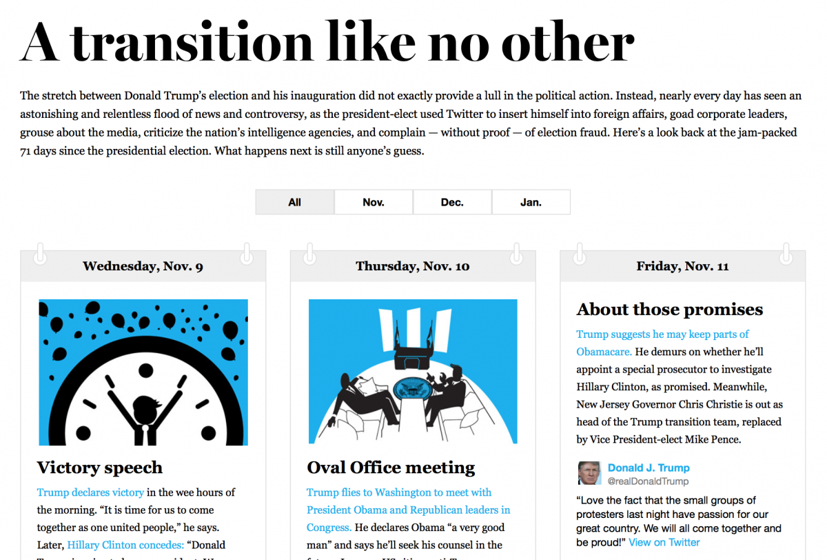
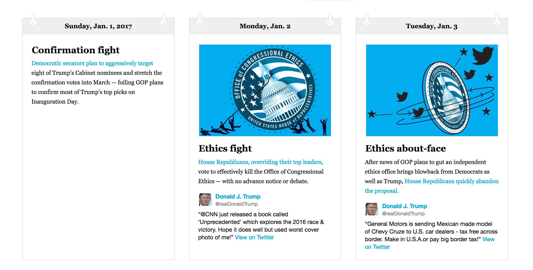
The Boston Globe has published a striking interactive graphic of the Trump transition. Titled “A transition like no other,” there’s an entry for every day since Donald Trump’s election. Each box has a thumbnail of the day’s major news and a link to the longer story. Most are accompanied by a tweet from Trump himself.
The graphic also appears in the print edition. But the digital version is more fully realized, and is worth checking out by anyone interested in digital storytelling. I emailed a few questions to Katie Kingsbury, the Globe’s managing editor for digital.

Who is the intended audience?
The past few months have been a whirlwind of news — this project was spawned out of a desire to capture the details amid that flood. Trump and his team made Cabinet decisions that will fundamentally change major geopolitical power structures that nations have relied on since World War II. He moved markets through Twitter. He took steps that will fundamentally undo Obama’s legacy over the next several months. Meanwhile, Obama was sanctioning a foreign nation for intervening in our presidential election.
Studies show that people spend very little time on news websites compared to print. One way to counteract that is to produce journalism that invites return visits. Are you hoping this is the sort of feature that people will keep returning to?
I do hope people keep returning to it. For one, it is meant to be a good way to showcase our archives for the past three months. For another, there is so much there — you need to spend some serious time with it to realize the breadth of all that has happened since November. My guess is this will become one of those projects that people return to as well months from now, when the details aren’t as fresh.
Do you plan to keep updating it? For how long?
We haven’t actually discussed that. It was no small investment by a lot of folks — [political editor] Felice Belman did an amazing job of sorting through 70-plus days of news and finding the best nuggets. [Digital design director] Michael Workman and [design director] Heather Hopp-Bruce spearheaded this gorgeous design for both online and the two-page spread in print. We have designers from across the building — Tonia Cowan, Ryan Huddle, Kelsey Kronmiller, and Brendan Lynch — who contributed illustrations. [Director of audience engagement] Matt Karolian and [deputy managing editor for audience engagement] Jason Tuohey have an ambitious social plan for today and tomorrow. Matt Ellis, our product manager, pulled together all these moving parts.
With that infrastructure in place, we would be able to keep it going without a ton of effort. Now I plan to explore that today. Thanks for the idea!
- Does better news coverage lead to greater voter engagement? The answer: It depends - October 13, 2021
- A group project in the age of COVID: What worked, what didn’t, and what we learned about making it better - February 3, 2021
- For journalism students reporting on climate change, a self-taught lesson in teamwork - October 19, 2018


