How The Pudding structures stories as visual essays
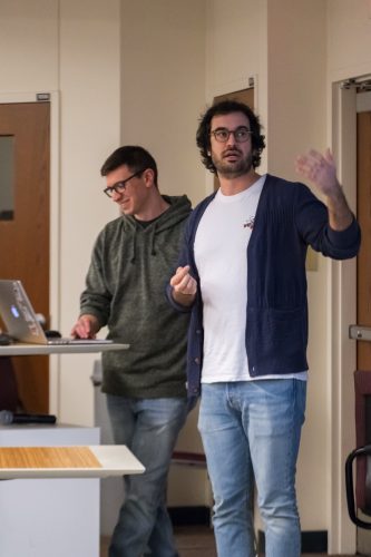
“We don’t tell 10,000-word stories like the New Yorker,” says Russell Goldenberg, one of the four minds behind the visual storytelling site The Pudding. “We try to examine complex topics the same way they do, but with visuals instead of prose.”
The Pudding, launched in 2017 as a site for arresting visual journalism and an extension of data design studio Polygraph, is a newcomer to the media scene and focuses on data, interaction and strong design to tell compelling stories. Its storytelling practices are not much different than those of any other media outlet: Come up with an interesting idea, find data, analyze it and produce an intriguing product. What makes The Pudding unique is the stories they choose to tell and the ways they present the data involved in those stories.
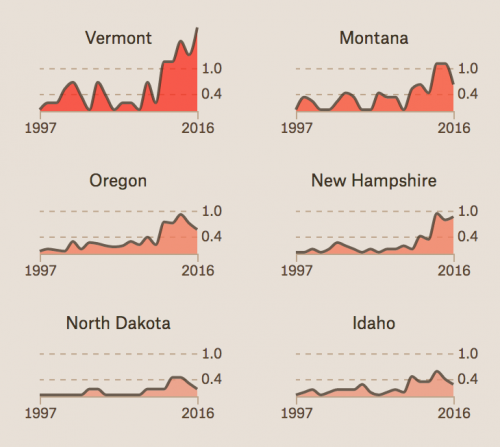
Projects include an interactive timeline of top-five billboard songs, beginning in 1958, which plays snippets of the number 1 ranked songs in order for seconds proportional to how long the song stayed in the lead; an interactive visualization of every line in Hamilton; and various maps, graphs, and lists displaying the emergence of slang based on searches for words’ definitions.
Engineering these visualizations can take anywhere from a couple of days to a couple of months depending on the complexity of the data and the graphics. With that much time investment, The Pudding tries to zero in on stories with a long shelf life.
“It’s not tied to the news cycle and that’s really important to us because we value longevity,” Goldenberg said recently at a Northeastern University event hosted by the university’s student-led design collective Scout. “We cover a lot of topics, and they don’t necessarily mesh all that well with things you might come across in typical journalism.” Furthermore, the team tries to bring new data to conversations, or look at data in new ways to further public discussion on topics they address.
With these guiding ideas, The Pudding has produced around 50 data stories in a format they call “visual essays.” Their mission is to produce weekly content by working with freelancers and commissioning pieces. In these pieces — which are usually sparse on words — data and design have to work together to carry the narrative, says fellow founder Ilia Blinderman.
“If you look at the stories that we’ve published and stories in the New Yorker, there’s one clear difference, and that is that prose-driven stories often rely on a single narrator, on a single character to drive the story forward,” Blinderman said. “Whereas with the sort of things we do, data has to really speak and be able to provide a conclusion. Visual stories really need clear, hard, underlying conclusions in order to be interesting to people.”

Thinking about story shape
The Pudding’s pieces generally follow a narrative arc, just like any other story, but theirs is different than traditional methods used for literature or journalism. While those storytelling forms may stick closely to their respective sets of narrative rules — like literature’s rising action, climax and denouement or journalism’s inverted pyramid — there is no one narrative shape that defines visual essays.
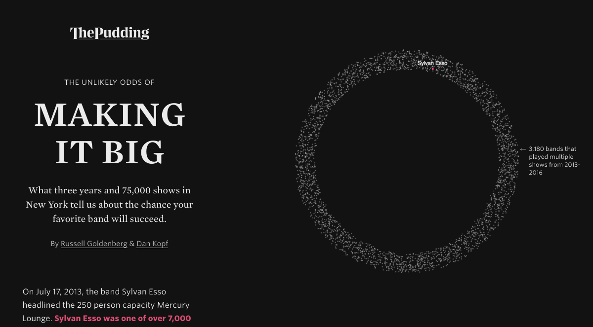
Goldenberg described the story arc for his piece on the odds a band will succeed in New York City as a symmetrical v-shape. First, the reader sees a circle of 7,000 dots representing bands that headlined small venues in the city. As they scroll down, they see only a handful of bands move into another circle representing a medium-sized venue and then only 11 bands end that up playing large venue. This is the tip of the “v” and the most narrow data point of the story.
The story then dives in to broader charts looking at the bands that made it, and how. “And then, finally, we end up with a graphic of all the people who didn’t make it, everybody else,” Goldenberg said. “So there’s tons of bands here: It’s just like a giant sad wall of people who haven’t made it yet, maybe, or they didn’t make it in the course of time when we were looking at it. This is kind of looking at all the data again.”
Another one of Goldenberg’s stories, which analyzed what city is the microbrew capital of the United States, is more like a lopsided, upside-down v-shape that starts at a specific point — the city the reader is located in and that city’s rating on the microbrew scale — and then slowly builds on itself until it shows a large, interactive segment of U.S. cities before narrowing again to detailed state-by-state backgrounds.
Those story contours are what The Pudding’s founders and contributors conceptualize after becoming deeply familiar with the data and thinking about how best to convey a specific story that the data has given rise to.
“Basically there’s a bunch of different ways that you can look at the shape of data,” Goldenberg says. “The thing to note of those shapes is that they’re super different, but in the end they both told a really interesting story. And the reason they were successful is because they both had variety in their shape and there was change as the story progressed — it wasn’t just a flat line.”