How the Wall Street Journal visualized the 500+ conflicts of interest of The Trumps
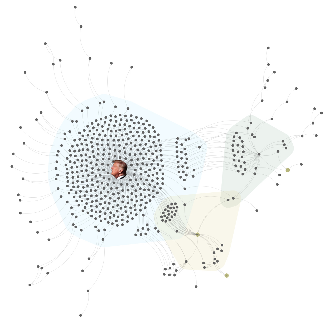
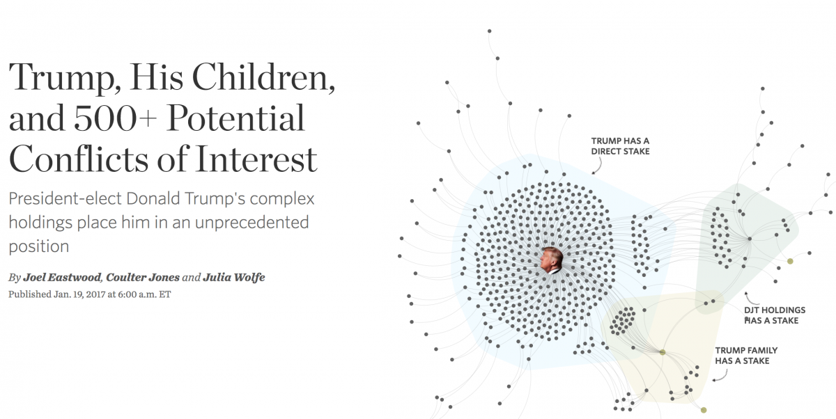
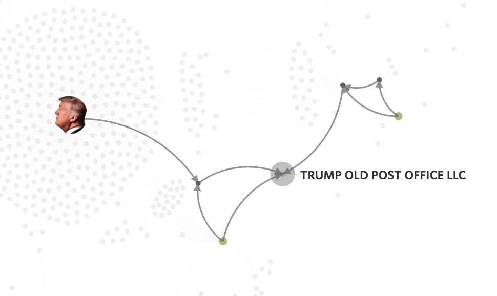
The Wall Street Journal recently published an interactive graphic showing the Trump family’s more than 500 potential conflicts of interest. In it, a galaxy of dots and lines show the complicated relationships between Trump, his children and a complex network of business holdings.
Storybench spoke with Joel Eastwood, the reporter, and Julia Wolfe, the graphic designer, about the project’s reporting, data cleaning and visualization. “The most difficult part of many visualization projects, and certainly of this one, was distilling a complex, messy dataset into a clean visualization with a clear takeaway,” says Eastwood.
How did you get the idea for this project?
Eastwood: The investigation team had been working to gather the data based on the content of Donald Trumps’ financial disclosure reports of 2016 and 2015. The team were trying to figure out what to do with them. They reached to me and we turned to Julia to get more insights on that.
It was a collaborate process. The original idea was to do a graphic-related story of President Trump’s holdings. We had a number of reporters who had a number of stories focusing on similar topics. They wanted the graphic to become a summarized overview of these stories.
Could you walk us through the reporting and visualization process?
Eastwood: The process started by looking at the data, going over the records, cross checking the spreadsheet to sort of clean up any errors or typos or problems coming from the OCR, that is optical character recognition (the mechanical or electronic conversion of images of typed, handwritten or printed text into machine-encoded text).
We found a lot of errors either in the original documents or in the process of transferring. It’s a lot of cleaning. I had a few meeting with editors and reporters, to discuss what we thought the story was, how to tell it with the data, trying to figure out what it would look like. From there, we began to make mock-ups, do a lot of different drafts, and some substitute options. That’s where Julia began to involve.
Wolfe: We had a few meetings to nail down the network visualization. Joel jumped back and forth, helping with cleaning the data, writing the scripts, getting some advice from the other reporters on the investigation team, coming back to me, making sure the visualization choice complied with the development of the story and what the data was showing.

We also got a lot of input from people in the newsroom. There were issues we heard over and over again. One issue was that people got confused about why dots clustered in certain areas. After we heard that from ten different people, we realized that we need to come up a way to drop it. That’s why we focused on creating different color backgrounds behind the dots.
In the process, visualization and reporting moved hand in hand. They really help to inform each other, like when the hover ability focuses on a certain path, the script should be about that path.
How did you transfer the PDF file into computer readable text? How did you clean the dataset?
Eastwood: The process is called OCR, optical character recognition. It’s a technology or process for computer recognition of non-computer-readable text. A number of program can do OCR, like Adobe Reader and Tabula.
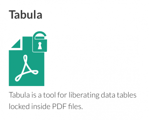
Tabula can convert a PDF file into structured machine-readable text, but you need a lot of manual cleaning and cross-checking. (Read the Storybench tutorial on Tabula.) After that, I did a lot to rearrange the data in order to get it into the structure we needed to generate D3 nodes (the essential elements D3 used to generate graphics).
The manual cross-checking was mostly done through Excel and Google Spreadsheets. There were a lot of reading through the list. Both Coulter [Jones] and I manually cross-checked each item of the list.
How did you make the visual choice?
Wolfe: We really worked together crafting the best visual choice for the data.
We wanted to be able to highlight the complexity of Donald Trump’s business holdings but still, bring enough clarity so readers wouldn’t feel overwhelmed.
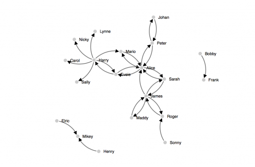
A lot of time was spent on the network chart, making sure it was as organized as possible, and bringing clarity to particular sections. Once we settled on the hover effect showing paths, we really started to feel like we had met the challenge of the data.
What difficulties did you meet in the process?
Eastwood: We initially struggled to find a way to display the complex web of relationships in a way that told a story, and didn’t require interaction from the reader.
We found the solution by adding annotations, colored labels, arrows and photos to the web, and only displaying smaller parts of it on scrolling to walk the reader through a complex visualization.
As the only person who took part in reporting, data analysis, design, and development, what role did you play in the process?
Eastwood: I was largely a coordinator on this project, bridging multiple parts of the newsroom and doing a little bit of everything: helping Coulter[Jones] to analyze and organize the data; meeting with reporters and editors to shape the direction of the story and script; mocking up designs of the visualization; and aiding Julia with the code.
My background is a reporter who learned to code and do data analysis and visualization, so on a project such as this, I find I can be most helpful as an intermediary between the reporters, editors, designers and coders.
What do you think is the most satisfying/unsatisfying part of the graphic?
Eastwood: My favorite part is the ability to hover on any nodes and see how the corporate entities are linked back to Trump. It’s a clever bit of code by Julia that instantly makes the web explorable and rewarding to interact with.
Probably the most unsatisfying part is how little information we have about some of the entities, which prevents us from giving a more in-depth explanation of why the network is structured the way it is. That’s a limitation of the data, and reflects the lack of transparency around Trump’s holdings.
If we had time to continue working on this visualization, I would want to continue to find intriguing stories within this web of connections and highlight those.
What javascript library did you use for this project?
Wolfe: Bootstrap is included in all our projects. I did use jQuery a little, but the library doing the most work is D3. I also used waypoints to trigger events on scroll.
I think the most useful bits of code already have some handy tutorials. I know the code from these pieces was instrumental for me.
These two examples are similar to our piece in terms of technical aspects, and the differences are just aesthetic. You can click the pictures to see the code. (Read the Storybench tutorial on building a force-directed graph in D3.)
The javascript of our piece is very similar to these two examples in terms of how the layout of the network graphic was drawn which we used D3. We turned off the constant movement because we thought that’s distracting. The second example shows how we drew the background colors.
Much of the rest was reasonably specific to this project and was largely just fiddling with the details.
What’s your advice for students who are interested in data journalism?
Wolfe: Figure out what area you are most excited about, data cleaning, data visualization, or reporting? Don’t try to do all at once.
Eastwood: Not getting too hung up on any individual technology or approach. It’s a discipline which has been evolved extremely quickly.
Telling an interesting point with clarity is more valuable than technical production. The indispensable skill for a data journalist is the ability to extract a single salient point from a complex dataset, and communicate it in an accessible way that doesn’t require the reader to wade through mounds of data.
Wolfe: Be excited about a career of alway learning.
What’s your advice for data journalism job hunters?
Wolfe: In the newsroom, you are judged by the work you have done. For the graphic team, they look at the portfolio because they want to see the examples of your work. It doesn’t have to be for big organizations. It could be your personal works on your own website, personal reporting, charts you made on your own time.
It’s really important that they could see you putting in your time and efforts.


Great Learning.
But i just want to add, can we get what more effort it took to publish the final draft?