One computer scientist’s strategies for improving network visualizations
We are living in a world that is awash in data. To present complex information, people use visualizations that help detect trends, clusters, gaps and outliers almost instantly. But are these visualizations always effective?
Cody Dunne, an assistant professor at Northeastern University’s College of Computer and Information Science, asked that question recently in a talk hosted by NUVis, Northeastern’s Visualization Consortium. Dunne introduced tips to help users create more effective and understandable visualizations as well as strategies for making analysis workflows repeatable, free of errors, and easily shareable.
Below are some takeaways from Dunne’s talk.
What is network visualization?
AT&T Labs’ Infoviz research group describes network visualization as: “There is information in the connections. A glance is enough to identify nodes with the most links, nodes straddling different subgroups, and nodes isolated by their lack of connections.”
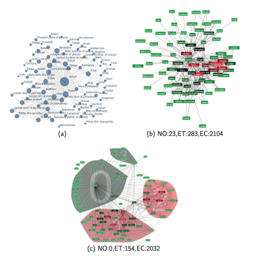
While referring to some interesting examples of network visualization, Dunne explained that those visualizations are widely used across diverse disciplines to convey complex information and behavior. They are also used in sociology to do social network analysis and in scientometrics to show citation networks or to understand research area. And they can be used in fields as diverse as politics, urban planning, medicine, archaeology and computer networks.
Techniques to visualize networks more effectively
Dunne also introduced two strategies to visualize networks more effectively.
First, he said, readability metrics to measure visualization effectiveness need improvement. By evaluating different layout algorithms, his research team is trying to get a sense of how a network’s nodes and edges contribute to readability problems.
Dunne and his team have incorporated readability metrics framework into SocialAction, a social network analysis tool that integrates visualization and statistics to improve analysis. SocialAction’s attribute ranking system allows users to quickly and visually pinpoint problem areas in the graph by drawing and dragging nodes and receiving real-time feedback.
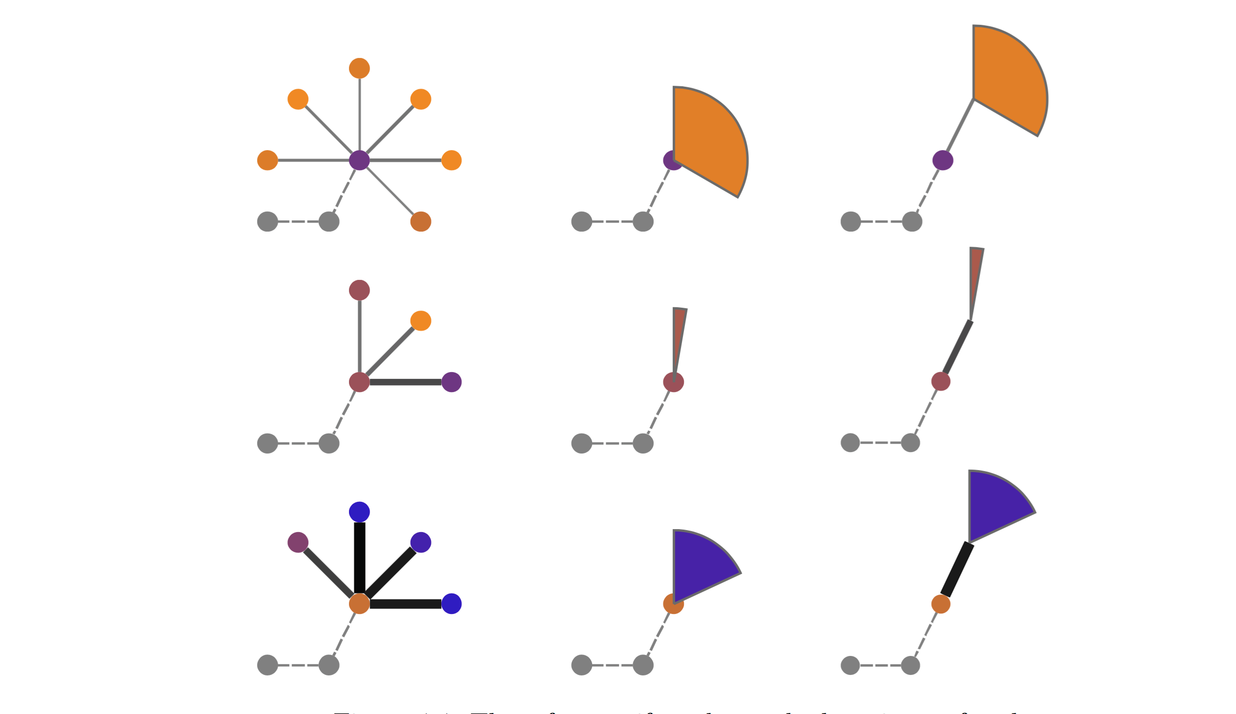
Second, Dunne offered a technique called “motif simplification” that identifies the repeating patterns in a network to reduce visual complexity. By replacing common motifs with easily recognized glyphs that require less screen space, the users can reveal otherwise hidden relationships, scrape out redundant information, and improve network analysis tasks.
Dunne ran a controlled experiment with 36 users and found that motif simplification could significantly improve user task performance. The tool – which is publicly available as NodeXL, a free, open-source template for Excel – was one of Dunne’s initial projects in network visualization.
GraphTrail improved collaborations between scientists and archaeologists
Analyzing complex data often requires several sessions and when returning to an analysis, it can be difficult to recall the steps you have taken in your workflow. What’s more, data science in many domains is also highly collaborative and multiple analysts usually need to work together. Dunne talked about visualization strategies that assist in making analysis workflows repeatable, free of errors, better understandable, and more easily shareable.
GraphTrail, said Dunne, is an interactive visualization program for analyzing networks that captures users’ interactions and integrates this history in a workspace interface. A field study by a team of archeologists and a qualitative laboratory study with ten users showed that GraphTrail could effectively improve analysis comprehension, insight discovery and exploration recall, said Dunne.