Getting started with data visualization in R using ggplot2
Creating a customized graph that communicates your ideas effectively can be challenging. This tutorial will introduce you to the popular R package ggplot2, its underlying grammar of graphics, and show you how to create stylish and simple graphs quickly. We will also go over some basic principles of data visualization.
Spending some time thinking about the structure/arrangement of your data set will help you produce a better visualization, and we have covered some common data wrangling tasks in these previous tutorials:
1. Getting started with RStudio Notebooks for reproducible reporting
2. Tidying data and the tidyverse
3. Exploring data using FiveThirtyEight’s R package
4. Manipulating data using the dplyr package
Starting your data visualizations with a pen and paper
The best place to start with any visualization is with a pen and paper sketch. I’ve found removing the confines of any particular software or program and brainstorming on paper helps get the first bad ideas out of the way. After I get an outline or sketch of the visualization I want to create, I figure out the details within whatever computer/software environment I’m using. I find this much more helpful than jumping in and programming from scratch – it’s much harder to end up in the right place if you have no idea where you’re going.
Graphs and comedy
My goal when I create a graph or visualization is to communicate an idea or some information about the underlying data (i.e., the differences, patterns, etc.) with a minimal amount additional explanation. In many ways, good graphics are like well-written jokes; if I have to explain my joke, it loses the desired effect. You’ve heard the phrase, “a picture is worth a thousand words.” Well, if I want the picture (i.e. the visualization) I create to be worth 1,000 words, any additional explanation I have to provide diminishes that word-value.
Graphs are also similar to jokes in that you should know your audience before delivering either. Thanksgiving dinner at your in-law’s house probably isn’t the place for Redd Foxx’s “What’s the difference between a pickpocket and a peeping tom? but you might get away with Abbott & Costello’s “Who’s on first?” Telling a joke to the wrong audience can be awkward (or even volatile) because 1) the joke failed to make the material relevant and funny, or 2) unknowingly encroached on a sensitive topic. Showing a visualization to the wrong audience is more akin to the first mistake (resulting in crickets, blank stares, or just being overlooked), but the second isn’t impossible. After all, data is information, so it’s a good idea to think about how a visualization you’re sharing will fit into your audience’s world view.
The comedian Jamie Foxx recently said he tests out his new stand-up material on his family before using it on stage. The reason? Beta testing rough jokes on an audience you trust enough to give you honest feedback is a great way to refine your work. That is also an excellent way to improve the reception of your data visualizations. By sending early drafts to friends and colleagues, you’re getting a fresh set of eyes on the graphs you’ve created to see if they’re communicating your ideas effectively.
The final similarity between jokes and data visualizations is their ability to influence their audience. Data visualizations from journalists like Alberto Cairo, Mona Chalabi, and Jeremy Singer-Vine have incited countless readers to demand that evidence accompanies journalism. The current media technology landscape continues to create opportunities for people to be influenced by data.
Many jokes are funny because they present the truth in a new and entertaining way, which brings me to the lesson I repeat to myself often: “it doesn’t matter if my visualizations look beautiful, get published, go viral, or even get read by everyone on the planet. It only matters that the reader understands what truth I was trying to tell.” After all, the goal here is communication, so anything short of comprehension by the intended audience is a failure.
Three goals for your data visualization or graph: 1) your audience sees your finished work (so you truly have to do it), 2) everyone in the intended audience understands the ideas or information you’re trying to convey, and 3) the audience is influenced by the data you’ve presented.
Communicating numbers with graphs
In 1985, two scientists at Bell Laboratories – William Cleveland and Robert McGill – published a paper on “visual decoding of elementary graphical-perception tasks” (i.e., which graph elements convey statistical concepts with minimal mental effort). The authors identified ten commonly used graphing elements for representing numerical data. Then they ran some experiments that tested people’s ability to quickly and easily see the relevant information each graph was supposed to convey. The authors used the results from these tests to rank the graphing elements according to how accurately the patterns in the data were perceived. Their ranking is below:
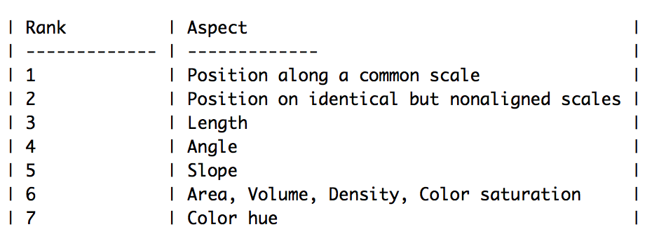
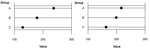
The point to notice here is that people could see the information and ideas in the graphs easiest when they were displayed using positions and geometric shapes (positioning, length, and angles). For example, the graphs below are presenting values in positions on a horizontal axis, easing our ability to make a comparison because the location of these values is on identical (but not aligned) scales.
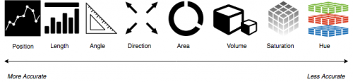
Nathan Yau from Flowing Data refers to this list of elements (but also includes ‘shape’) as the visual cues in a graph or visualization. Below is a visual ranking of each item adapted from Yau’s text, Data Points. These elements are one of four visualization components he covers (the other three being a coordinate system, scale, and context).
Leland Wilkinson’s Grammar of Graphics presents a unique system for creating graphics in a distributed computing environment (this was implemented in SPSS as GPL). Hadley Wickham expanded and adapted Wilkinson’s grammar to the R language in the ggplot2 package.
Why have a grammar of graphics?
Having a grammar of graphics allows us to build graphs using an official syntax. The individual components of each graph are like parts of a well-written sentence. Composing clear, well-structured sentences isn’t easy. To quote Stephen Pinker,
“appreciating the engineering design behind a sentence – a linear ordering of phrases which conveys a gnarly network of ideas — is the key to understanding what you are trying to accomplish when you compose a sentence.”
The ggplot2 syntax uses layers as a “linear ordering of phrases” to build graphs “which convey a gnarly network of ideas.” Stated simply – the underlying grammar provides a framework for an analyst to build each graph one part at a time in a sequential order (or layers).
The composition of ggplot2 calls have five parts:
1. A data set
2. The aesthetic mapping ( aes() )
3. A statistical transformation ( stat = )
4. A geometric object ( geom_ )
5. A position adjustment ( position = )
Univariate plots
Many times you will be interested in just seeing the distribution of a single variable. There are a few ways to do this, but the most common are histograms (a kind of bar-chart), and density plots.
Recall above we said each graph in ggplot2 needs the data, an aesthetic, a statistical transformation, a geometric object, and a position adjustment. We are going to create a histogram of Height by specifying each component.
The data set
We will use a variety of data sets throughout this tutorial, starting with data from the National Health and Nutrition Examination Survey, in the NHANES package. It is important to note that ggplot2 (and other packages in the tidyverse are designed to work with tidy data.
library(NHANES)
nhanes_df <- NHANES::NHANES %>% tbl_df()
nhanes_df
Let’s get a quick summary of the Height variable from our nhanes_df data set using the dplyr functions. The help info on Height tells us: “Standing height in cm. Reported for participants aged 2 years or older.”
nhanes_df %>%
     dplyr::select(Height) %>%
     summarise(
         min = min(Height, na.rm = TRUE),
         max = max(Height, na.rm = TRUE),
         mean = mean(Height, na.rm = TRUE),
         median = median(Height, na.rm = TRUE),
         iqr = IQR(Height, na.rm = TRUE),
         sd = sd(Height, na.rm = TRUE),
         missing = sum(is.na(Height)),
         total_non_miss = sum(!is.na(Height)),
         total = n()
)
Specificity is what makes the dplyr functions so flexible. Unfortunately, this specificity comes at the expense of a lot of typing for basic numerical summaries. If I had to do this for every variable in my data set, it would 1) get tiring and 2) increase the chances of error.
But we can also get a quick number summary using the fav_stats function from the mosaic package. We will add some formatting from the knitr package to make the output look prettier, too.
knitr::kable(
nhanes_df %$% fav_stats(Height)
)
NOTE: The %$% operator is another magical tool from the magrittr package and handles functions that don’t return a data-frame API. Use it when the regular pipe doesn’t work.
The aesthetic layer
The pipe (%>%) operator makes the ggplot code easier to read and write by adding each layer of the graph logically like the parts of a sentence (data %>% aesthetic + geom).
With the pipe we can map the aesthetic x to variable Height and create our first graph using the layer() function:
# assign data and variable to aesthetic
nhanes_df %>%
     ggplot(mapping = aes(x = Height)) +
# add the necessary layers
     layer(
          stat = "bin",
          geom = "bar",
          position = "identity")
Ah! What are these warnings and messages?
ggplot2 is pretty good about warning you whenever data are missing. This doesn’t surprise us because we had 353 missing values in our summary above (why do you think these data are missing?).
The message is telling us how many “bins” our data has been divvied up into. The default is set to 30.
A statistic for a geom
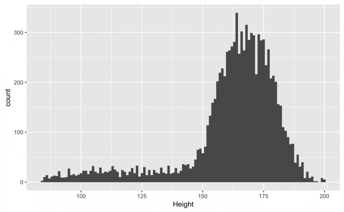
The stat = “bin” is a default setting for histograms, and we can adjust the binwidth values by specifying the params = list(binwidth = 1). The simplest way to understand bins is by setting it to extreme values. We will set the binwidth to a small and large value to demonstrate how bins influence the histogram.
If I use a low bin number (binwidth = 1), then I can see the numbers of bars in my histogram has increased. Also, we can see there is a dip in the number of Height values around 170.
# assign data and variable to aesthetic
nhanes_df %>%
     ggplot(mapping = aes(x = Height)) +
# add the necessary layers
          layer(
               stat = "bin",
                    params = list(binwidth = 1),
               geom = "bar",
               position = "identity")
Conversely, if I set the binwidth to a larger number (like “35“), I’ll get fewer bars, and some of the nuanced aspects of the distribution are lost.
# assign data and variable to aesthetic
nhanes_df %>%
     ggplot(mapping = aes(x = Height)) +
# add the necessary layers
          layer(
               stat = "bin",
                    params = list(binwidth = 35),
               geom = "bar",
               position = "identity")
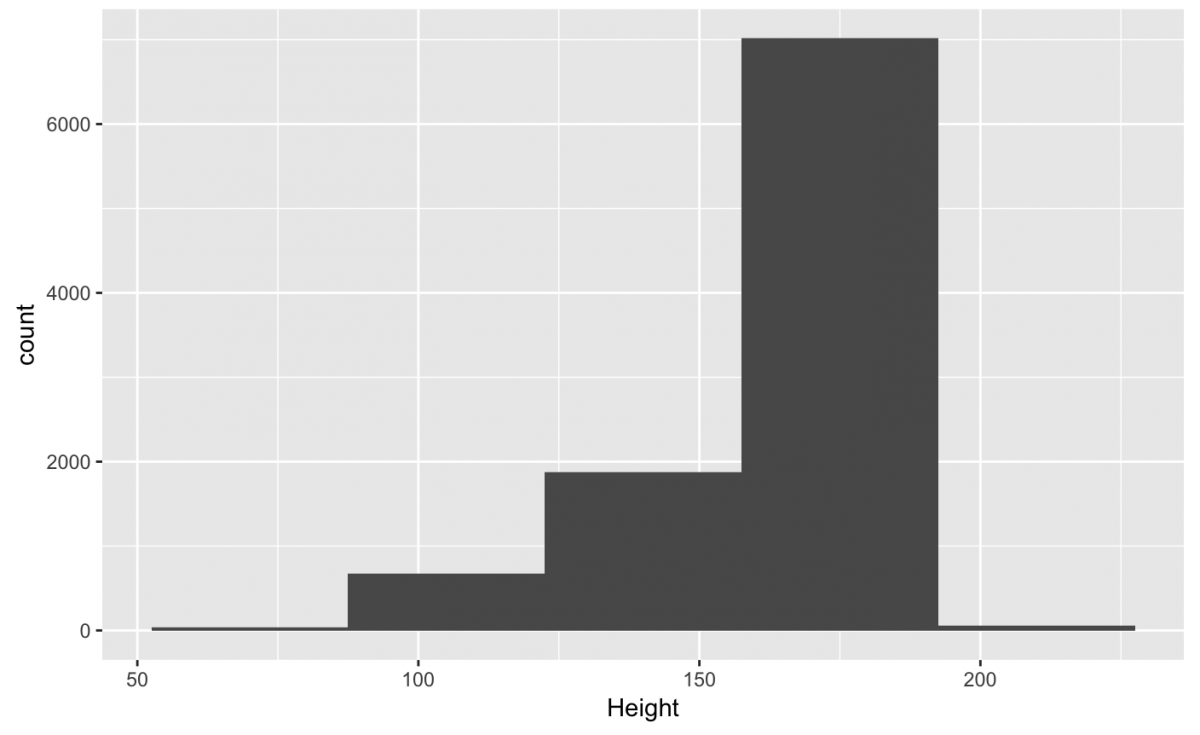
NOTE: Small number of bins means many bars, a large number of bins means fewer bars.
Finding the best setting for binwidth depends on the data set, but the goal is to give the viewer an idea of the underlying distribution of the variable.
A geom for a statistic
We said earlier that a histogram was a kind of bar chart, so the geometric object for this graph is the bar (not histogram). The bars, in this case, are the predetermined bins.
The positions for everyone
The position = identity doesn’t make any changes to the data on this geometric object (because the bars don’t need to be adjusted).
Putting it all together
We just specified all five components for a simple histogram (the data, the aesthetic mapping, the stat, the geometric object, and the position) using the layer function. This is a lot to remember (and type!). The beauty of ggplot2 is that we don’t have to state every component explicitly. Each geometric object (geom) comes with a default statistic (stat). The converse is also true (every stat belongs to a default geom). This lightens the mental load when we want to use the grammar to build a graph because we don’t have to remember what stat goes with each geom.
Histograms
A histogram breaks up the whole range of values in a variable into bins or classes. Each bar in the graph represents an interval for the value of a variable (“bins”), and the graph counts the number of observations whose values fall into each bin.
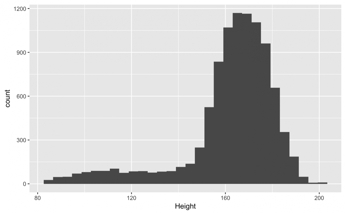
We don’t need to type out each layer explicitly. We can get a basic histogram by adding the geom_histogram() to nhanes_df %>% ggplot(aes(x = Height)).
nhanes_df %>% ggplot(aes(x = Height)) +
     geom_histogram()
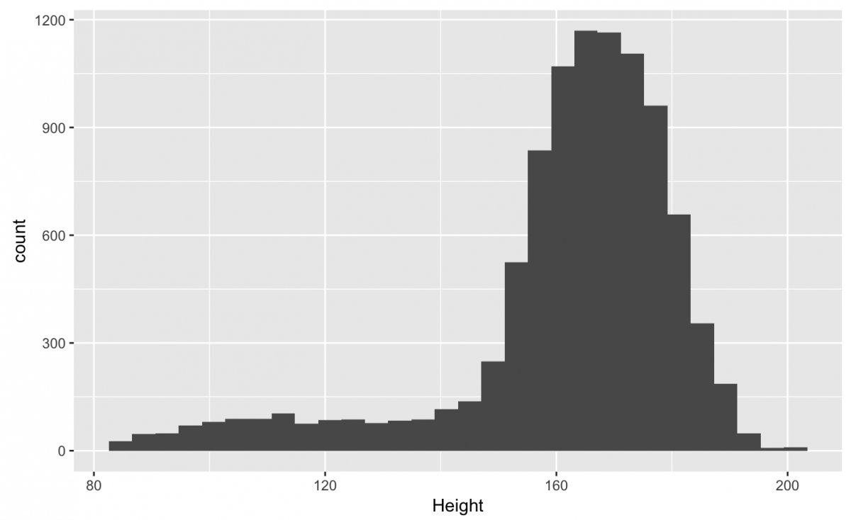
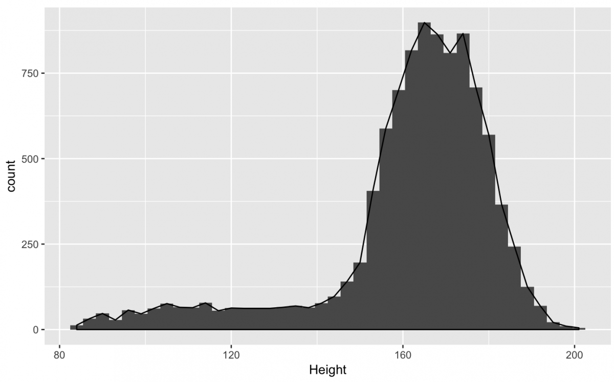
I recommend assigning the data %>% ggplot(aes()) to an object (named gg_something) so you can cut down on typing. We can also specify the binwidth inside the geom_histogram() function (along with the na.rm = TRUE argument to remove that pesky message).
gg_nhanes_ht <- nhanes_df %>% ggplot(aes(x = Height))
gg_nhanes_ht +
     geom_histogram(binwidth = 3,
                    na.rm = TRUE)
NOTE: Missing data is a huge topic and you always think carefully about how (and when) you choose to remove observations from a data visualization (or analysis).
There you have it – this is how ggplot2 builds a graph by layers. After you’ve identified a data set, the variables get set to aesthetics (i.e. the plotting position along the x axis), then geoms (the bars, points, lines, etc.) get added to build the graph. As we move forward, you will see that additional variables can be set to different aesthetics (color, size, shape, etc.) and additional geoms can be added to enhance the graph.
Now that we have a handle on the grammar, let’s look at two additional univariate plots.
Density plots
The geom_density() plot works a lot like the histogram, but draws a line instead of the bars.
gg_nhanes_ht +
          geom_density(na.rm = TRUE)
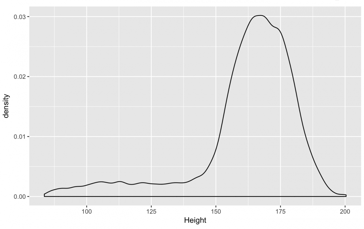
This distribution looks close to the histogram, but not identical. That’s because the default stat for the geom_density() is stat = “density”. The underlying math in “density” produces a slightly different visual representation of the distribution. However, we can specify the same stat = “bin” and set binwidth = 3 to get a distribution that is almost identical to the histogram.
gg_nhanes_ht +
     geom_density(
          stat = "bin",
          binwidth = 3,
          na.rm = TRUE)
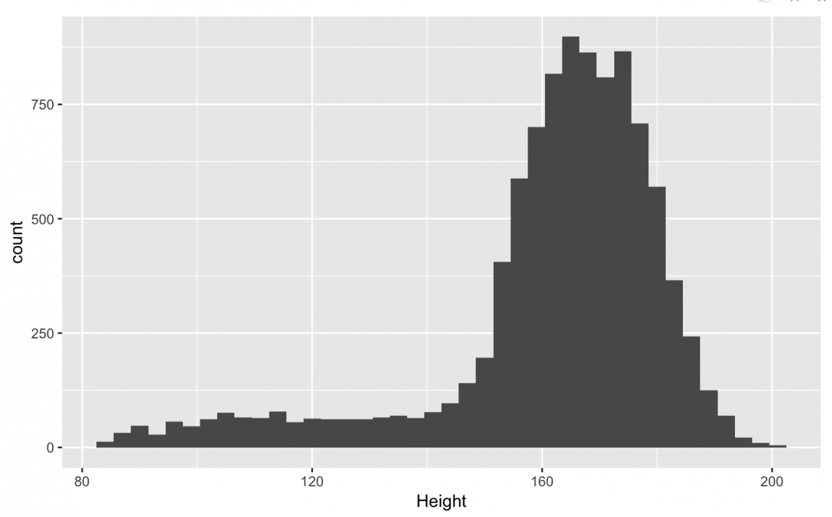
As we stated earlier, the great thing about the ggplot2 is how easily you can combine different geom‘s in the same plot. For example, if I wanted to layer the geom_histogram() under the geom_density(), I can just use the + symbol to combine them.
gg_nhanes_ht +
     geom_histogram(
          binwidth = 3,
          na.rm = TRUE) +
     geom_density(
          stat = "bin",
          binwidth = 3,
          na.rm = TRUE)
This is a little hard to see because both distributions are black/gray. But I can use the color, fill, and size aesthetics to make it easier to see these two geoms.
gg_nhanes_ht +
     geom_histogram(
          binwidth = 3,
          fill = "white",
          color = "steelblue",
          na.rm = TRUE) +
     geom_density(
          stat = "bin",
          binwidth = 3,
          size = .7,
          color = "red",
          na.rm = TRUE)
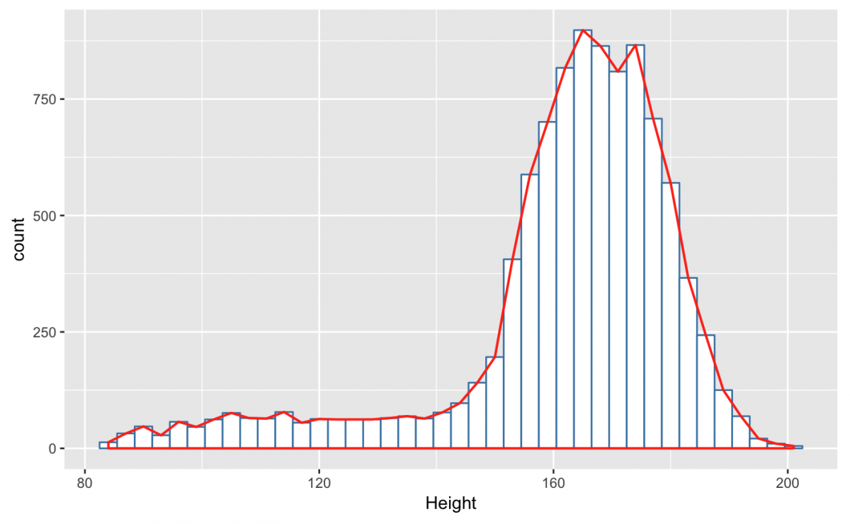
Is this graph more clear than simply using either the geom_density() or geom_histogram()? I tend to think one representation of a distribution is enough for one graph, but this example illustrates how each function works with their statistic, and how we can combine two geoms into the same graph.
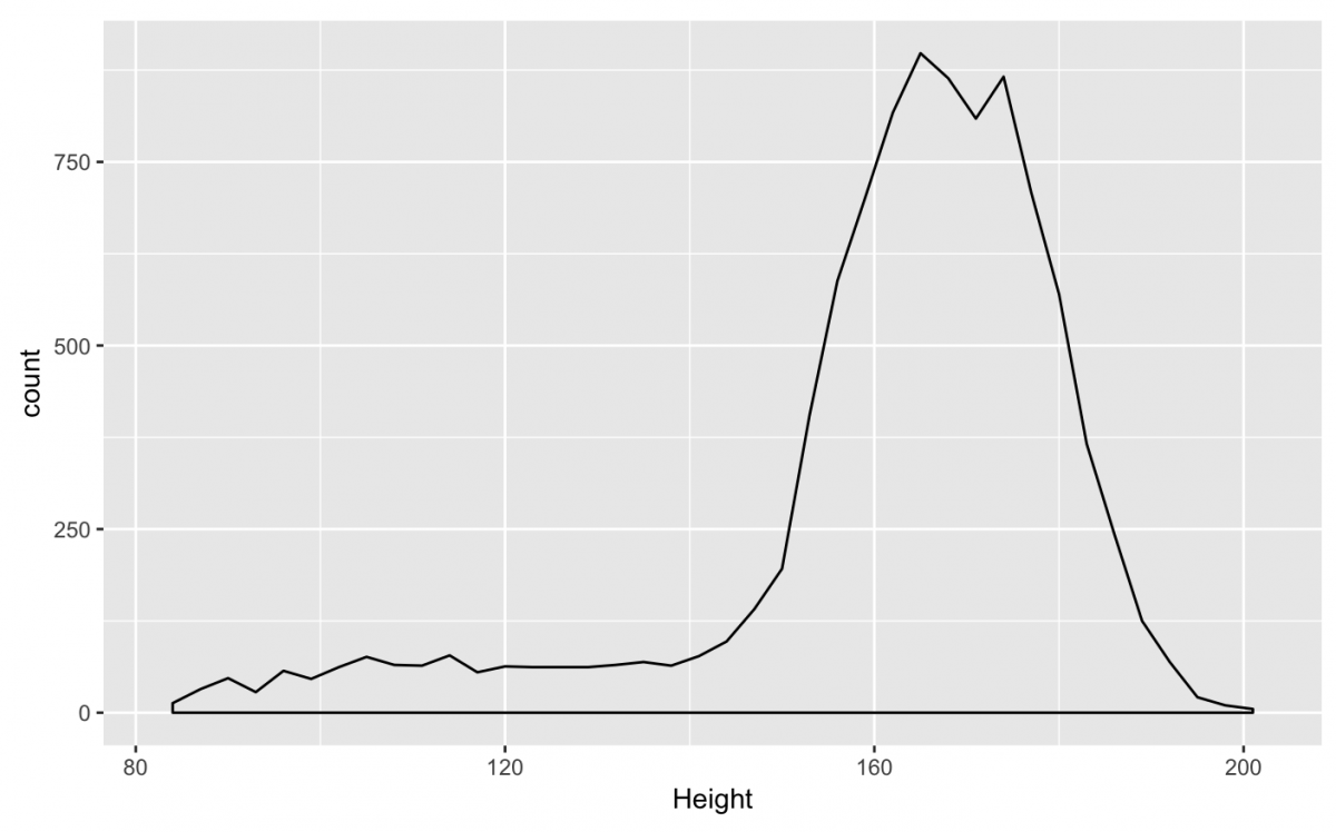
Bar charts
The final univariate plot we will look at is the bar chart(geom_bar()). A bar chart is like a histogram, but instead of binning the data, the observations get counted (stat = “count”). This means every observation contributes one unit of height for each bar. To get rid of the warnings, we will remove the missing Height values using na.rm = TRUE in our bar chart geom.
gg_nhanes_ht +
          geom_bar(na.rm = TRUE)
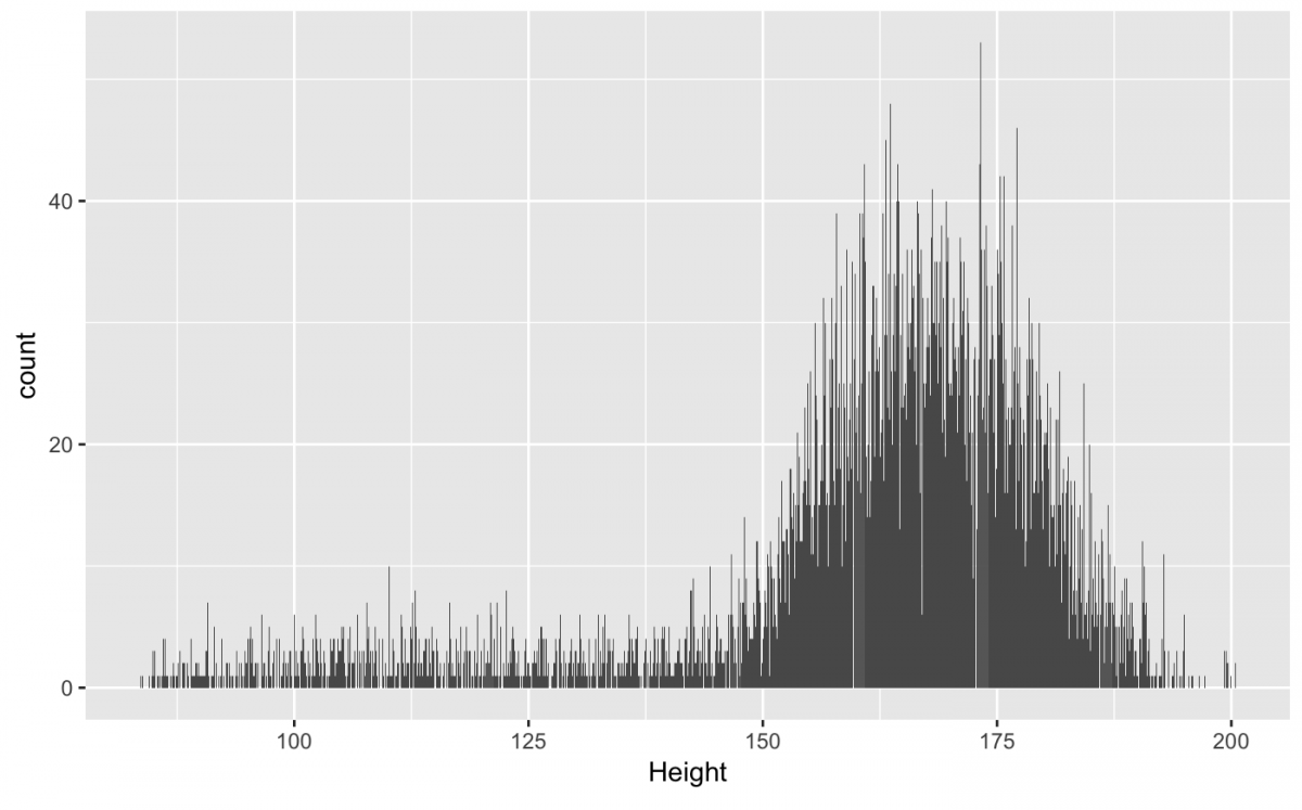
The stat = “count” is why we see gaps between the bars (not possible when using stat = “bin”), can you explain why?
Which graph is best? A bar chart gives us a very granular picture of the data, and the histogram and density plot do a better job of displaying the underlying distribution of the Height variable. Each graph serves its own purpose, so best really depends on the intention of the analyst.
Multivariate plots
Now that we’ve used the ggplot2 grammar for single variable graphs, we will explore visualizing two variables in the same graph. By adding more variables into the same plot, we get more graph options. But many of these additional options come with a cost of complexity, so choose carefully how many you include avoid chart junk.
Some common multivariate plots are scatter plots, line-plots, box-plots, or point-plots. We will start by graphing two continuous numerical variables.
Scatter plots
Scatter plots are great if you have two variables that are measured on continuous numerical scales (i.e. dollars, kilograms, ounces, etc.). We will look at the relationship between weight and height in Major League Baseball players from the Master data set in the Lahman package.
First, we will get a summary for each variable:
Summary for height:
bb_df <- Lahman::Master %>% tbl_df
bb_df %$% fav_stats(height)
Summary for weight:
bb_df %$% fav_stats(weight)
I find it helpful to think about what I’m expecting to see before I start building graphs. I’m expecting there to a positive association (or correlation) between height and weight. As one goes up, so does the other (and vice versa).
To check this, I can create a scatter plot using geom_point() (and filter the missing values using na.rm = TRUE).
gg_bb_wt_ht <- bb_df %>%
      ggplot(aes(x = height, y = weight))
gg_bb_wt_ht +
      geom_point(na.rm = TRUE)
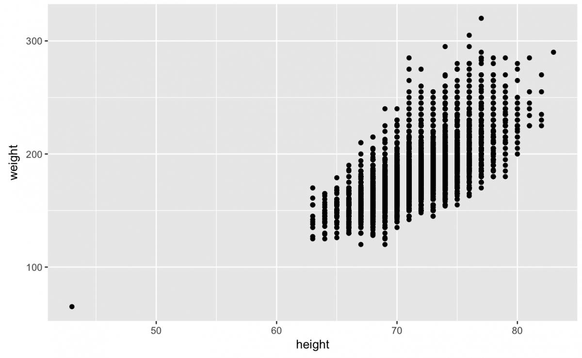
What can we see here? I think my expectations were met. But it looks like there’s one tiny baseball player all alone out there in the lower-left corner of the graph. I want to be able to identify this player by name – do you have any ideas about how to do that?
Well, in order to solve this problem, we need to attach a name to this data point. We already know how to select() and filter() observations based on their values, so why don’t we start with these functions.
# select the variable of interest
tiny_player_df <- bb_df %>%
      dplyr::select(weight, # weight
                    height, # height
                    nameGiven) %>% # nameGiven
      filter(height < 50 & weight < 70)
tiny_player_df
Identify and label outliers
Now we can go back to our original scatter plot and add another layer. However, this time we specify the data within the geom_text(), add the label aesthetic for the player’s name (nameGiven), and specify what size to make the text. I also want to adjust the alpha level inside the geom_point(). The alpha is a measure of transparency or saturation, so by making the number less than 1, the points will be slightly transparent.
gg_bb_wt_ht +
      geom_point(alpha = 1/2,
                 na.rm = TRUE) +
      geom_text(data = tiny_player_df,
                 aes(label = nameGiven),
                 size = 2.5)
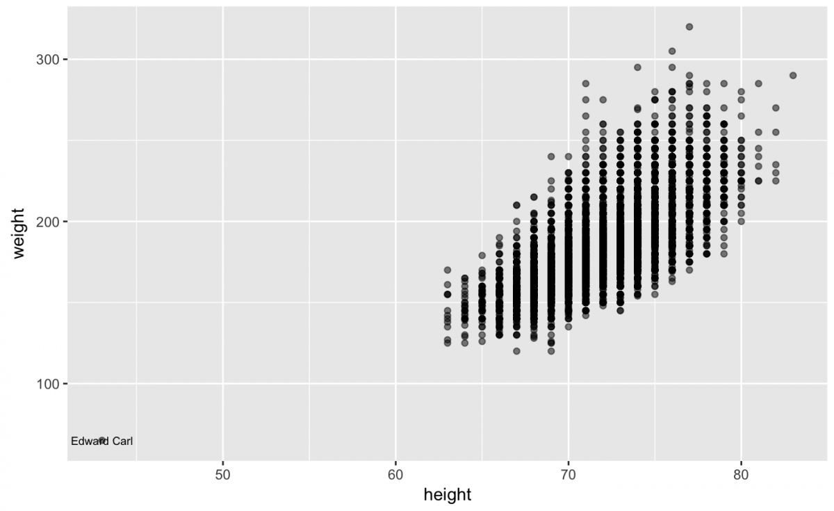
Using geom_text() is great for clearly labeling data points and outliers, but use it sparingly. Too many words on a graph make it difficult to read the text and know what to focus on. Adjusting the alpha is a great way to show where many data points cluster or overlap.
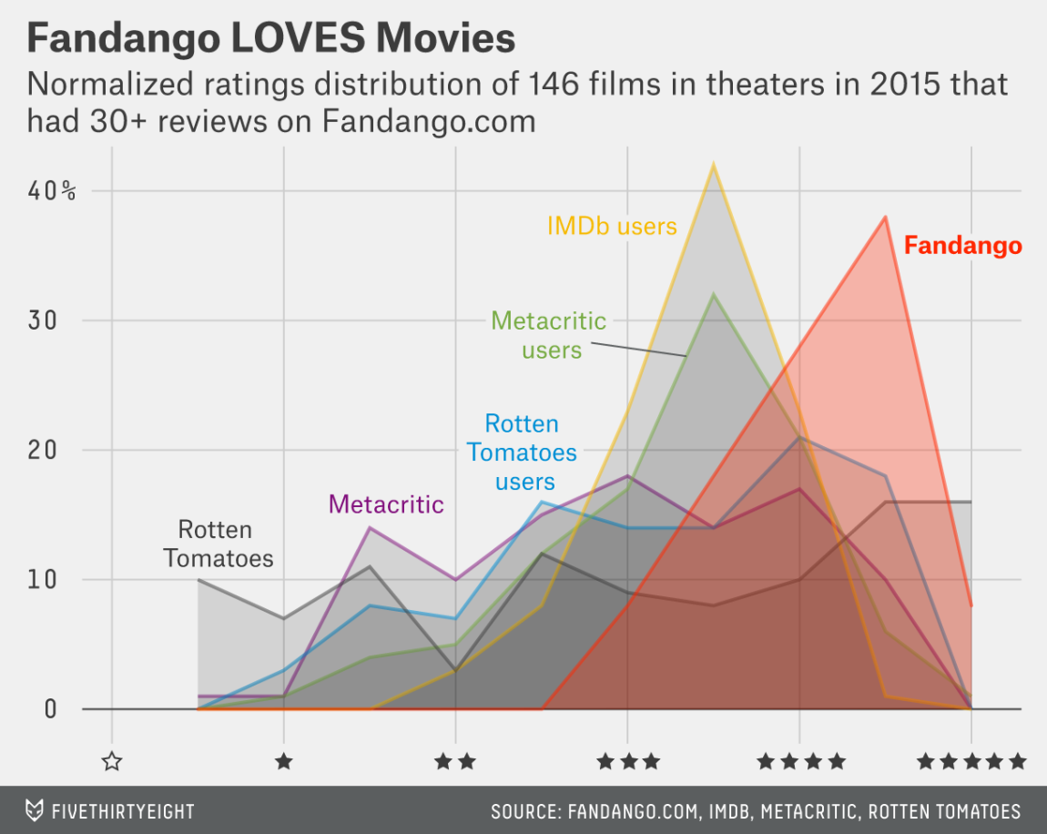
We are going to move onto a new set of variables from a different data set to continue exploring scatter plots. Let’s see the relationship between Metacritic and Rotten Tomatoes movie critic scores for films in the fandango data set from the fivethirtyeight package. These data were used in the FiveThirtyEight story “Be Suspicious Of Online Movie Ratings, Especially Fandango’s.”
First we will get the summary stats for the critic scores from rottentomatoes:
fan_df <- fivethirtyeight::fandango %>% tbl_df()
knitr::kable(
fan_df %$% fav_stats(rottentomatoes)
)
And now the summary scores from metacritic critics.
knitr::kable(
fan_df %$% fav_stats(metacritic)
)
And now we will get a scatter plot (geom_point()) comparing these two variables. This time we won’t adjust the alpha level.
gg_fan_critics <- fan_df %>%
      ggplot(aes(rottentomatoes, metacritic))
gg_fan_critics +
      geom_point()
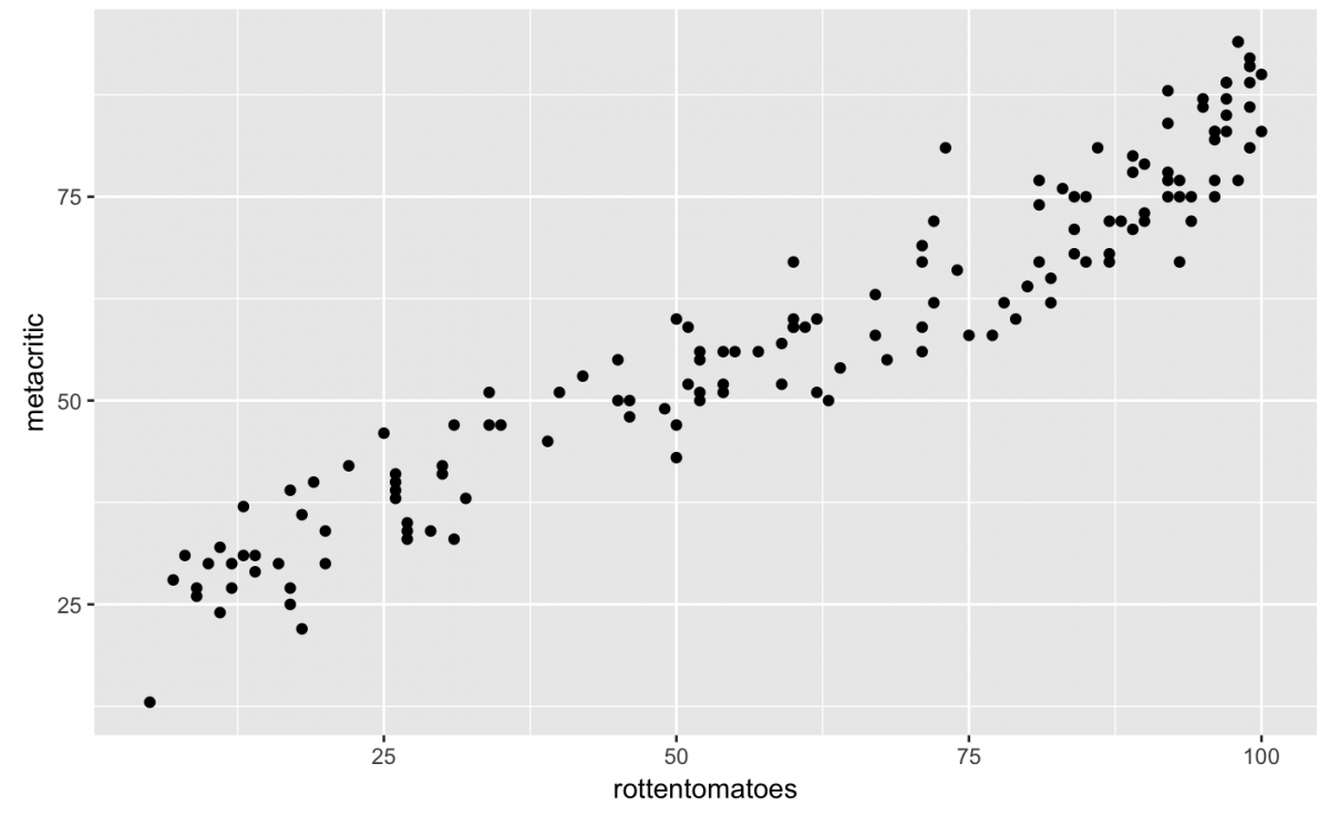
These two variables seem correlated (as y increases so does x, and vice versa), but what if I also wanted to see if the user scores from each site have the same relationship?
Below are the summaries for Rotten Tomato user scores:
knitr::kable(
fan_df %$%
     fav_stats(rottentomatoes_user)
)
and the users from Metacritic summary:
knitr::kable(
fan_df %$%
      fav_stats(metacritic_user)
)
Now we can add these two variables the same way we added the geom_text() in the last plot (i.e. by specifying a separate data frame inside the second geom_point() layer).
# get the df with user scores
user_df <- fan_df %>%
     dplyr::select(rottentomatoes_user,
                   metacritic_user)
gg_fan_critics +
     geom_point(color = "red") + # make the critic colors red
     geom_point(data = user_df, # assign the data inside geom_point()
                aes(rottentomatoes_user,
                    metacritic_user),
                color = "blue") # make user colors blue
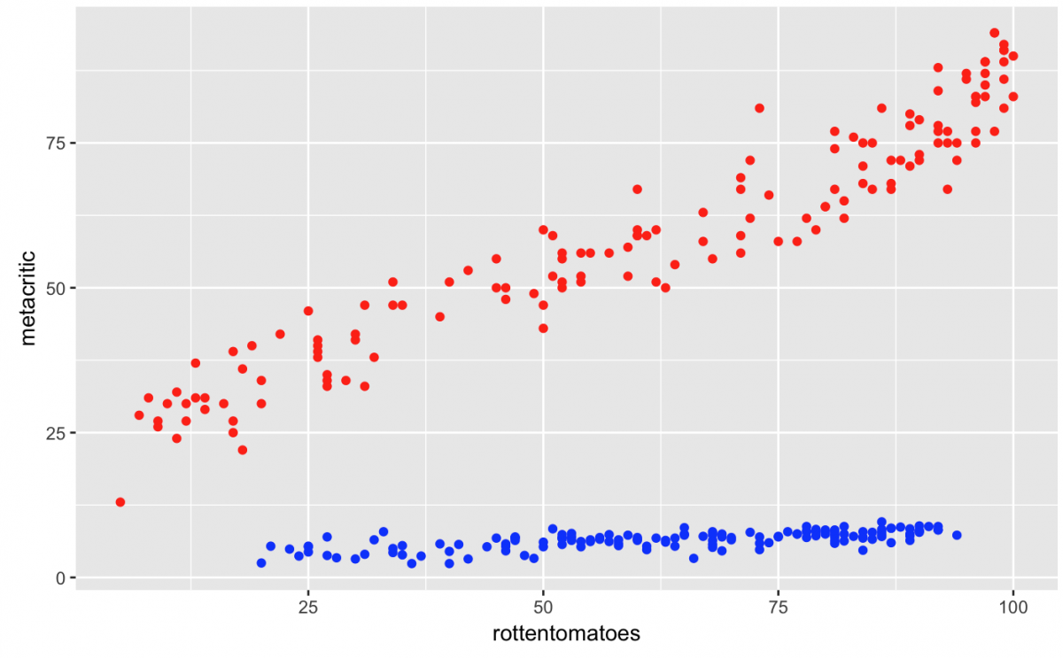
Wow, what is going on here? It looks like all the Metacritic users gave really low ratings for the movies in the data set. This is depicted by the flat line of blue points. Do Metacritic users really dislike all the films they see? Are they hipsters?
No. In case you didn’t catch it, the user ratings for Metacritic are on a different scale than the critics (1-10 vs 1-100), so this scatter plot is uninterpretable with these two geom_point() layers.
But this graph can serve as an important lesson: Just because the code worked, doesn’t mean the graph makes sense.
If we wanted to plot users and critics using two geom_point() layers, they need to be on the same measurement scale. That is why the metacritic_norm, metacritic_user_nom, rt_norm and rt_user_norm variables have been created for –they are on a normalized 0 – 5 scale.
Layer scatter plots on a common scale
meta_df <- fan_df %>%
     dplyr::select(metacritic_norm,
                   metacritic_user_nom)
fan_df %>%
     ggplot(aes(rt_norm, rt_user_norm)) +
     geom_point(color = "tomato2") +
     geom_point(data = meta_df,
                aes(metacritic_norm,
                    metacritic_user_nom),
                color = "steelblue1")
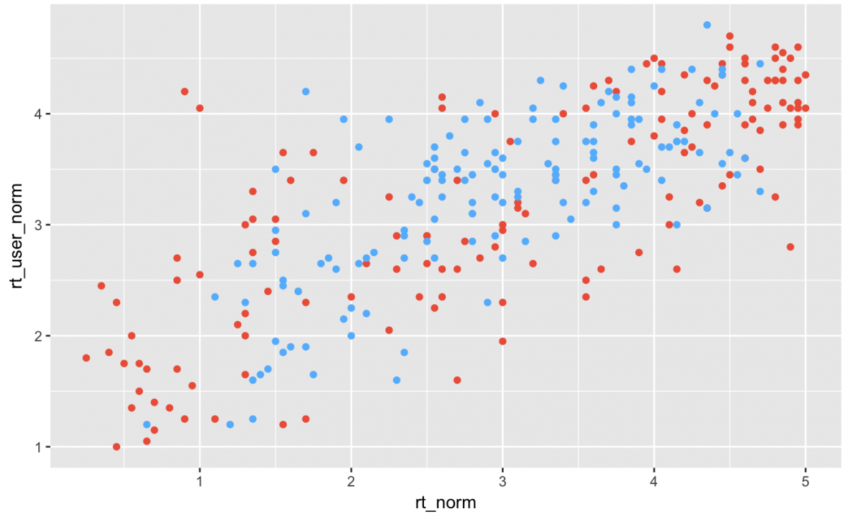
Do the normalized relationships look as correlated as the raw critic scores? You should read the article to find out more.
Line plots
Line plots are great if you have a numerical quantity (ounces, meters, degrees Fahrenheit) that you want to see over levels of a categorical variable (males vs. females, low vs. medium vs. high, etc).
To build a line chart, we will use World Bank Open Data on the percent contribution to each country’s GDP by three sectors in their economy: agriculture, the service sector, and industry. Only the top ten countries are in this data set.
I’ve downloaded these data and stored them in .csv files for you to access. Run the code below and you’ll have three data frames in your working environment (ag_gdp_df, ind_gdp_df, serv_gdp_df).
ag_gdp_df <- read_csv("https://raw.githubusercontent.com/mjfrigaard/storybenchR/master/data/aggdp_worldbank.csv")
ind_gdp_df <- read_csv("https://raw.githubusercontent.com/mjfrigaard/storybenchR/master/data/indgdp_worldbank.csv")
serv_gdp_df <- read_csv("https://raw.githubusercontent.com/mjfrigaard/storybenchR/master/data/servgdp_worldbank.csv")
Per usual, the raw data are not clean, so we will tidy them.
# tidy the WORLDBANK data
ag_gdp_df <- ag_gdp_df %>% gather(key = year, value = ag_prec_gdp, -Country)
ind_gdp_df <- ind_gdp_df %>% gather(key = year, value = ind_perc_gdp, -Country)
serv_gdp_df <- serv_gdp_df %>% gather(key = year, value = serv_perc_gdp, -Country)
We will start with looking at the percent contribution to GDP from the agriculture sector. Let’s take a glimpse() at the data frame.
ag_gdp_df %>% glimpse()
Hmm… year should be numerical or date, but I will start by converting it to a numerical variable for now.
# convert year
ag_gdp_df$year <- as.numeric(ag_gdp_df$year)
Now we can create a line plot. We will map year to the x aesthetic, ag_perc_gdp to the y, and group by the Country.
gg_ag_gdp <- ag_gdp_df %>%
      ggplot(aes(x = year,
                 y = ag_prec_gdp,
                 group = Country))
gg_ag_gdp +
      geom_line(aes(color = Country), na.rm = TRUE)
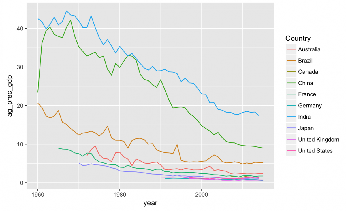
This looks like there has been a drop in the contributions of agriculture to GDP across the 10 countries represented in our data, but I can’t see the dates very well. How many years are represented here?
ag_gdp_df %>% distinct(year) %>% nrow()
Adjusting axis scales
Eek! I probably can’t plot all 56 distinct years, but I can compromise and plot 5-year increments.
I will use the scale_fill_continuous() function and set the breaks and labels vector. I’ll also remove the x label with labs(x = NULL).
gg_ag_gdp +
     geom_line(aes(color = Country), na.rm = TRUE) +
     labs(x = NULL) +
     scale_x_continuous(breaks = c(1960, 1965, 1970, 1975, 1980, 1985, 1990, 1995, 2000, 2005, 2010, 2015),
                        labels = c("1960", "1965", "1970", '1975', '1980', '1985', '1990', '1995', '2000', "2005", "2010", '2015'))
This looks better, but I want to add a geom_point() to make the values stand out more for each year.
gg_ag_gdp +
     geom_line(aes(color = Country), na.rm = TRUE) +
     geom_point(aes(color = Country),
                size = 1,
                na.rm = TRUE) +
     labs(x = NULL) +
     scale_x_continuous(breaks = c(1960, 1965, 1970, 1975, 1980, 1985, 1990,1995, 2000, 2005, 2010, 2015),
                        labels = c("1960", "1965","1970","1975","1980","1985","1990", "1995","2000","2005","2010","2015"))
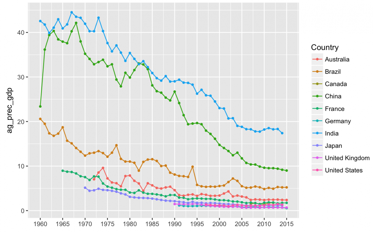
I think that illustrates the changes better than just a line plot. Now we can see that the agriculture sector has been contributing less to GDP over the last 50+ years in most of these countries. Let’s see how this compares to the other two sectors.
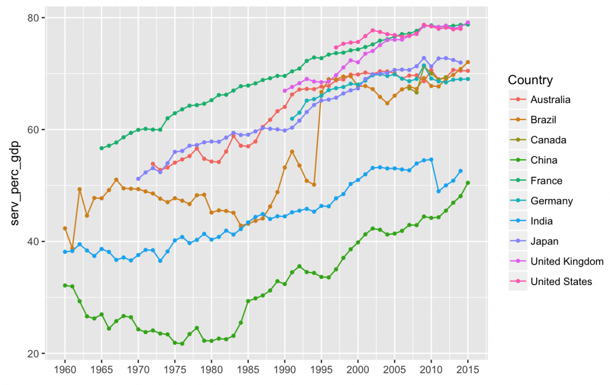
Summary for the contribution from services sector:
# we know this needs to be numeric
serv_gdp_df$year <- as.numeric(serv_gdp_df$year)
knitr::kable(
serv_gdp_df %$%
     fav_stats(serv_perc_gdp)
)
Line plot for services sector:
gg_serv_gdp <- serv_gdp_df %>%
     ggplot(aes(x = year, y = serv_perc_gdp, group = Country))
gg_serv_gdp +
     geom_line(aes(color = Country), na.rm = TRUE) +
     geom_point(aes(color = Country), size = 1, na.rm = TRUE) +
     labs(x = NULL) +
     scale_x_continuous(breaks = c(1960, 1965, 1970, 1975, 1980, 1985, 1990,1995, 2000, 2005, 2010, 2015),
                        labels = c("1960", "1965","1970","1975","1980","1985","1990", "1995","2000","2005","2010","2015"))
Summary for the contribution from industry sector:
# create numeric year
ind_gdp_df$year <- as.numeric(ind_gdp_df$year)
Industry summary:
knitr::kable(
ind_gdp_df %$%
fav_stats(ind_perc_gdp)
)
Line plot for the industry sector.
gg_ind_gdp <- ind_gdp_df %>%
     ggplot(aes(x = year, y = ind_perc_gdp, group = Country))
gg_ind_gdp +
     geom_line(aes(color = Country), na.rm = TRUE) +
     geom_point(aes(color = Country), size = 1, na.rm = TRUE) +
     labs(x = NULL) +
     scale_x_continuous(breaks = c(1960, 1965, 1970, 1975, 1980, 1985, 1990,1995, 2000, 2005, 2010, 2015),
                        labels = c("1960", "1965","1970","1975","1980","1985","1990", "1995","2000","2005","2010","2015"))
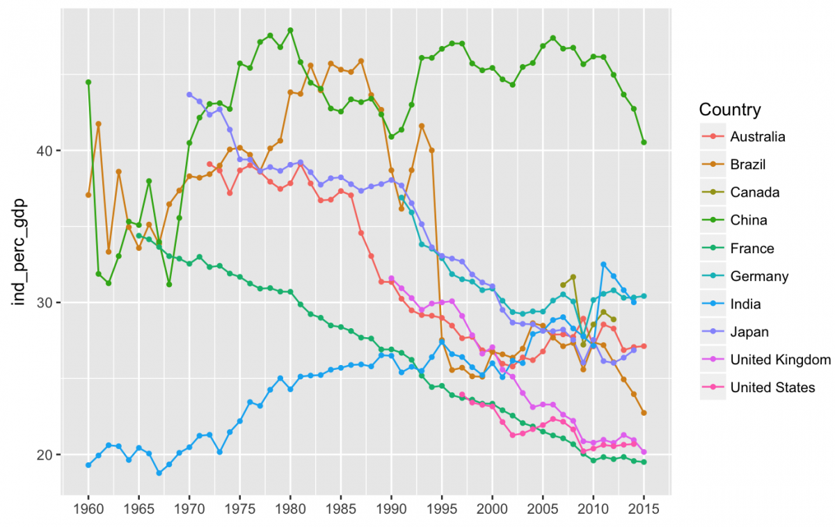
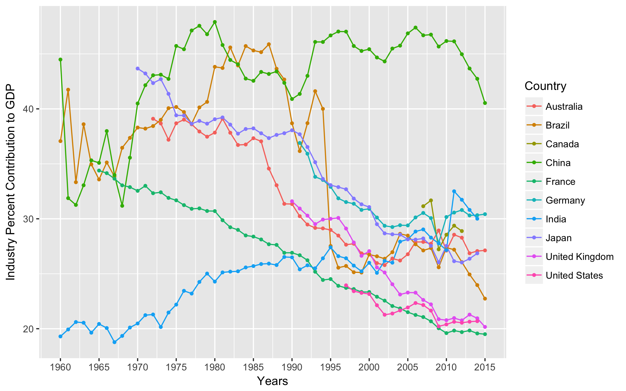
It looks like since 1960, agriculture has contributed less to GDP, the service sector has started to contribute more, and the industry sector does not have a straightforward trend. Note that India has seen an increase in the industry sector’s contribution to their GDP, while most of the other countries have seen the industry sector contributions fall over the last 2-3 decades. China stands out as an industry giant, and Brazil had a sharp drop between 1990 and 1995.
Bar charts (stacked)
We can use the stacked bar charts to show relative proportions of numerical variables across categories or stratified by other variables in a data set. We are going to use the data from “Where People Go To Check The Weather” by FiveThirtyEight.
weather_df <- fivethirtyeight::weather_check %>% tbl_df()
weather_df %>% glimpse()
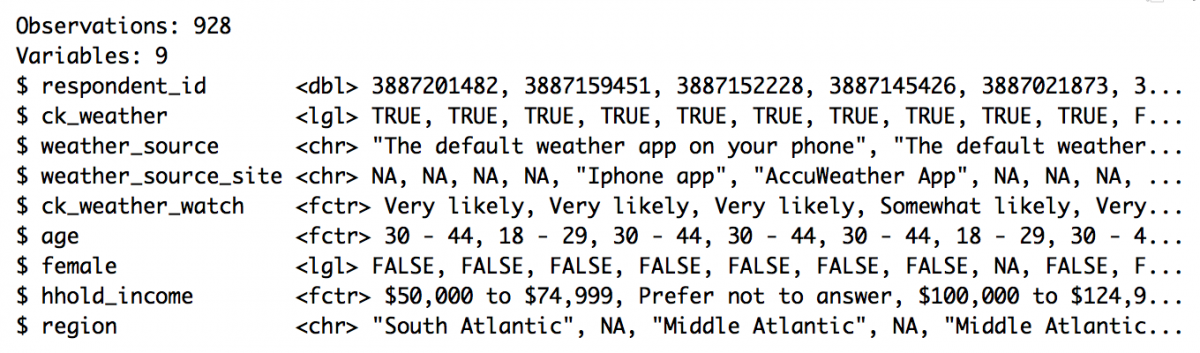
This data comes from a survey, and as you can see, all variables are all logical lgl, character chr, or factor fctr. Calculating a mean or median doesn’t really make sense with data like these because the numerical quantity would have no meaning. These are best summarized using the count() or distinct() functions.
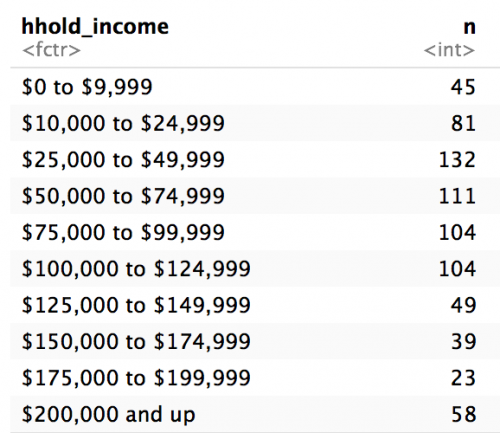
weather_df %>% count(hhold_income)
Being curious people, we might wonder about responses to the question, “If you had a smartwatch (like the Apple Watch), how likely or unlikely would you be to check the weather on that device?”
weather_df %>% count(ck_weather_watch)
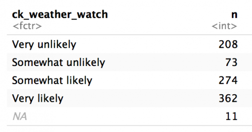
And we want to compare this variable with the responses to the people who answered, “Do you typically check a daily weather report?” (TRUE or FALSE).
We will create a bar chart with these data using color (fill) to represent the ck_weather.
gg_weather_watch <- weather_df %>%
     ggplot(aes(x = ck_weather_watch, fill = ck_weather))
gg_weather_watch +
     geom_bar()
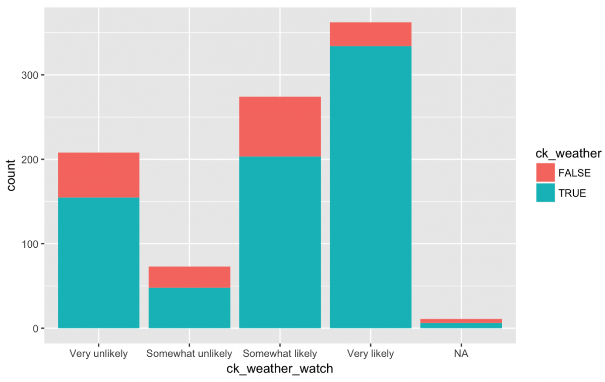
What do we see? More people checking the weather are apparently also more likely to check a hypothetical weather watch app. Still, many people who stated they were Very unlikely to check a weather watch app also said they checked the weather report daily (TRUE). Do they feel loyalty to their meteorologist or hate watches?
Maybe checking your weather is a regional phenomenon? Lets look at a bar chart of ck_weather by x = region:
gg_weather_region <- weather_df %>%
     ggplot(aes(x = region, fill = ck_weather))
gg_weather_region +
     geom_bar()
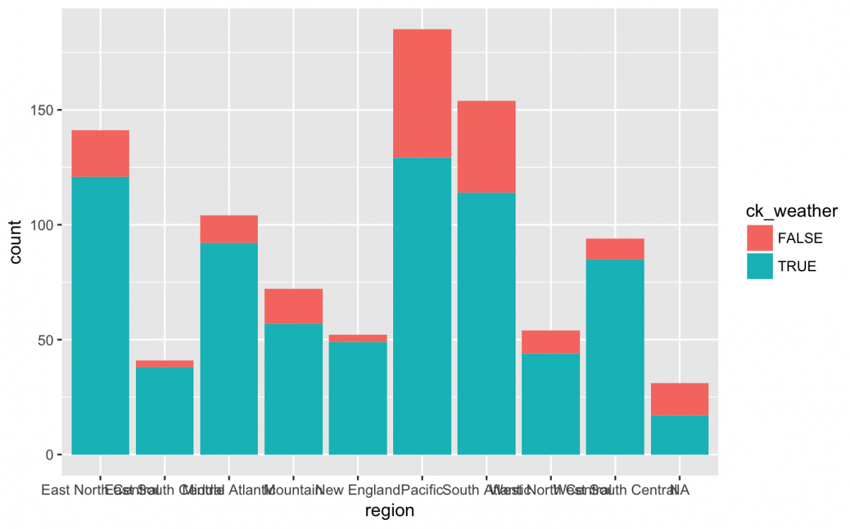
Hmm…we can’t really see what’s going on with the x axis because the label text is on top of each other. I should adjust this with a theme(axis.text.x) function. I also want to move the bars next to each other using position = dodge.
Using themes and positions
gg_weather_region +
     geom_bar(position = "dodge") +
              theme(axis.text.x = element_text(angle = 45,
                                               hjust = 1))
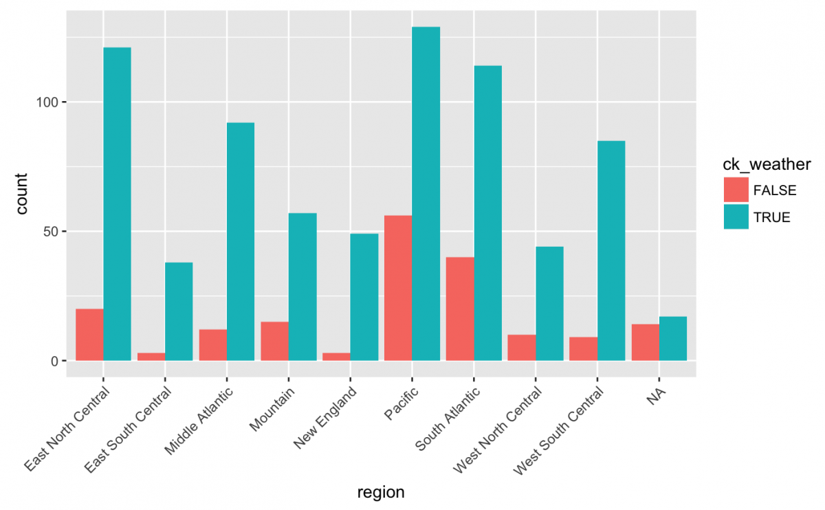
The top three regions for checking weather were Pacific, East North Central, and South Atlantic. Any ideas why?
Ok, maybe the willingness to check the phone app (ck_weather_watch) has more to do with the household income (hhold_income) and not the geographic location (region) reported by the respondents?
gg_weather_income <- weather_df %>%
     ggplot(aes(x = hhold_income, fill = ck_weather_watch))
gg_weather_income +
          geom_bar(position = "dodge") +
                   theme(axis.text.x = element_text(angle = 45,
                                                    hjust = 1))
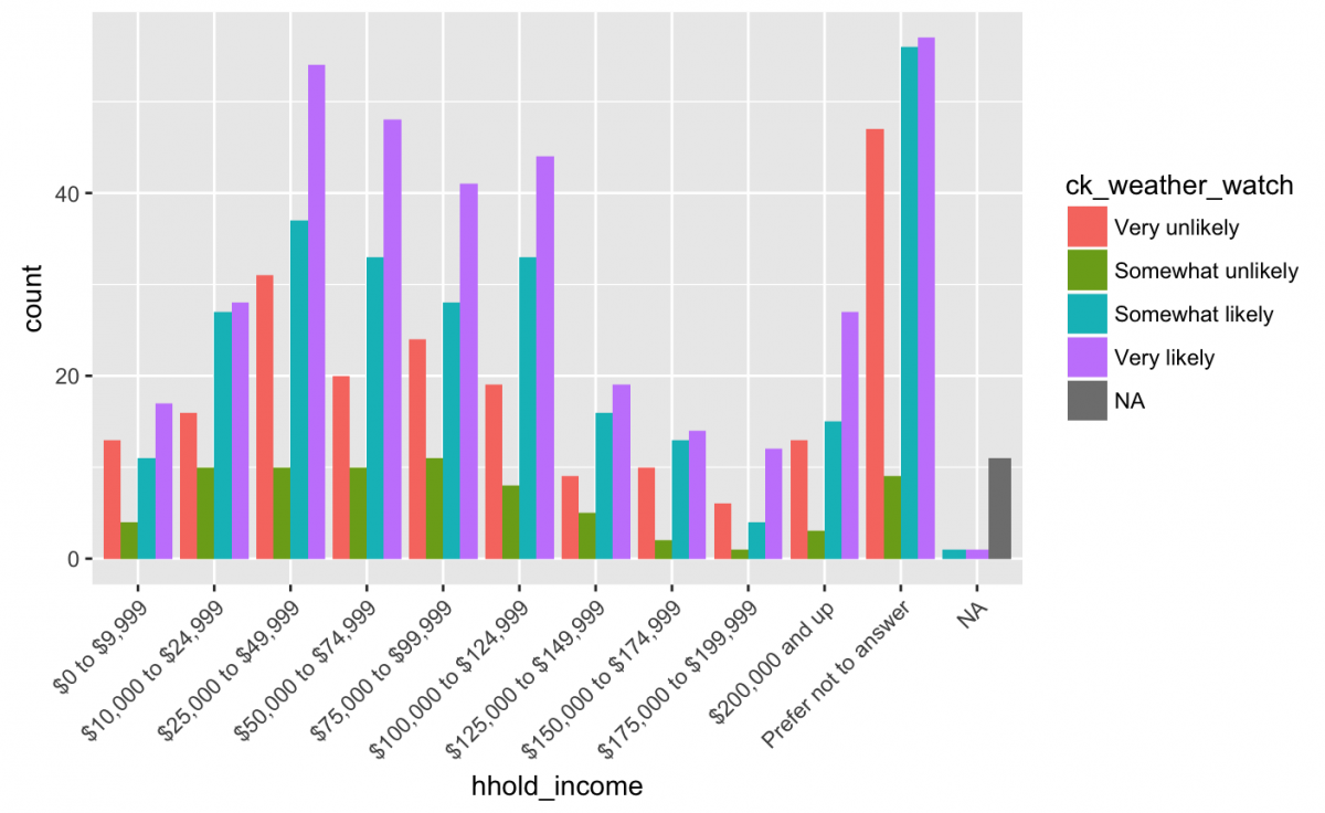
Well, we see the responses for Very likely (i.e. purple) have an upward trend from $0 to $9,999 to $25,000 to $49,999. We can also see the responses for Very likely are always higher than the other available responses (regardless of hh_income). Any thoughts as to why?
This graph was actually a little difficult to read because of the angle of the text and so many different bars, so I am going to shift the layout by adjusting the coordinates.
Flip coordinates
Long labels like this are easier to read if we adjust the axis with coord_flip().
gg_weather_income +
      geom_bar(position = "dodge") +
            coord_flip()
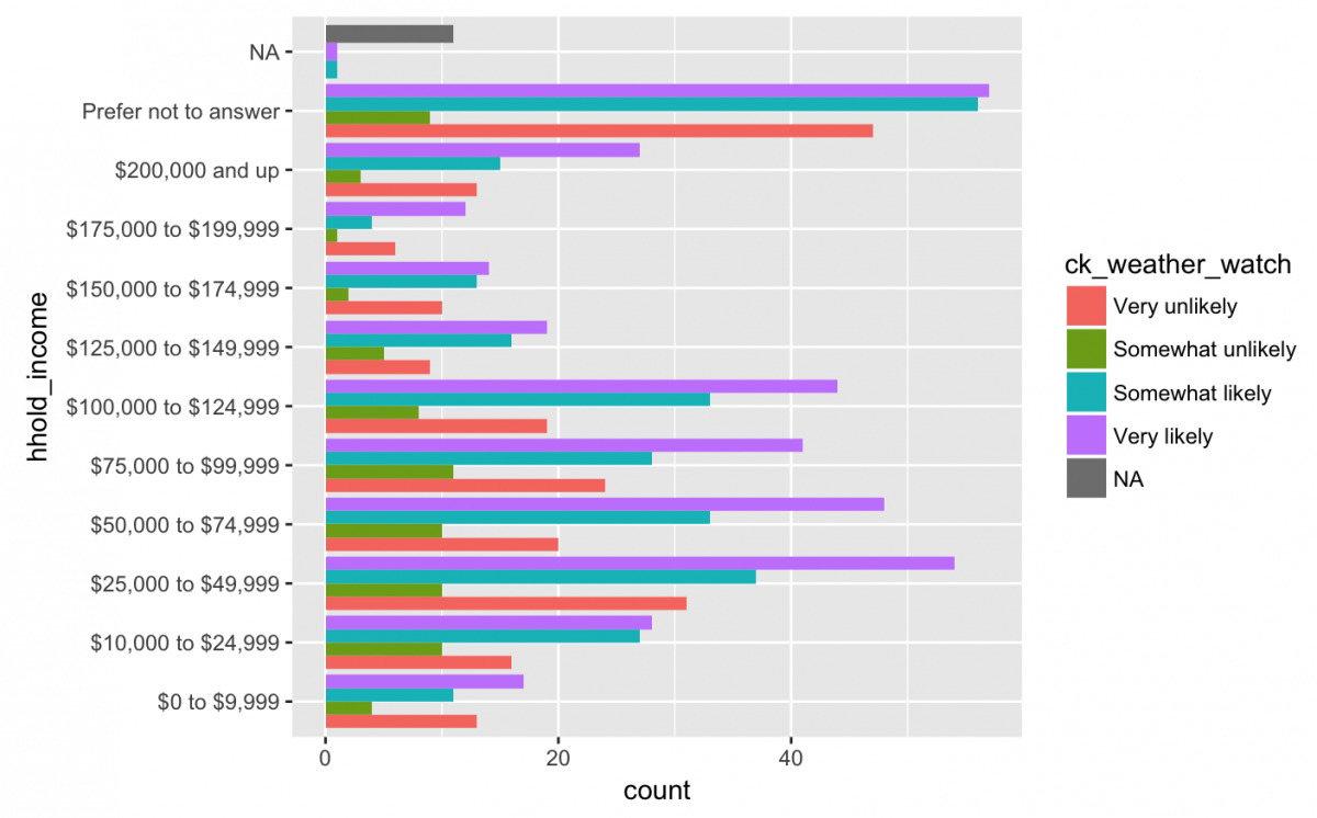
That looks better.
But the ordering looks strange with the Prefer not to answer at the top next to NA. These are conceptually different (i.e. “I’d rather not say” is not the same as “missing”) so I want them at different ends of the y axis. Fortunately, I can reorder these using fct_relevel() from the forcats package.
Relevel factors
library(forcats)
gg_weather_income_relevel <- weather_df %>%
     ggplot(aes(x = fct_relevel(hhold_income,
                                "Prefer not to answer"),
                fill = ck_weather_watch))
gg_weather_income_relevel +
               geom_bar(position = "dodge") +
               coord_flip()
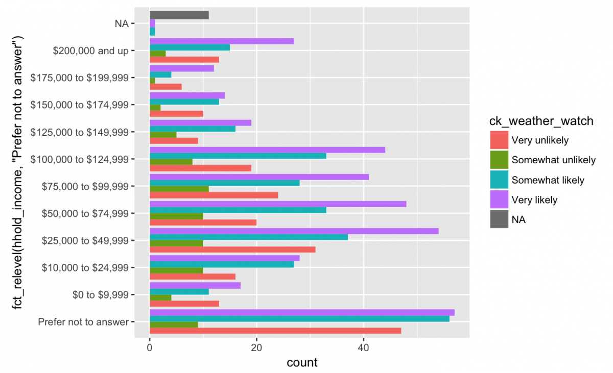
It looks like people who “Prefer not to answer” about their household income are also the people who report being most likely to check a weather watch app. Any other noticeable trends? For some reason, Somewhat unlikely has the lowest count in all categories of hhold_income. It is because when someone asks you if you’ll use their app, people have the hardest time saying, “probably not”?
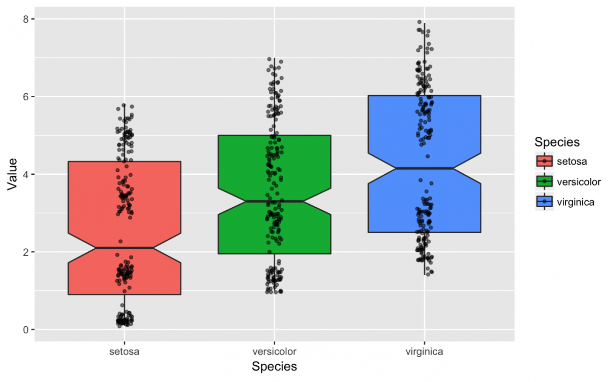
Box plots
The final plot we will cover in this tutorial is the box plot. The box plot is a visual representation of a five number summary (the min, Q1, median, Q3, and max of a variable).
To show this plot we will us the iris data set in the datasets package. This is a “famous” set of data (if there is such a thing) because of its publication history. While the publication is certainly a product of its time (the Annals of Human Eugenics isn’t around anymore for a reason), the data continue to be useful for many analysis and visualizations.
From the help file:
“This famous (Fisher’s or Anderson’s) iris data set gives the measurements in centimeters of the variables sepal length and width and petal length and width, respectively, for 50 flowers from each of 3 species of iris. The species are Iris setosa, versicolor, and virginica.”
iris %>% glimpse()
The first thing you should notice is that these data are not tidy because we see .Length and .Width repeated across columns. These are both Measurement‘s so they should be gathered up (gather()) into one variable.
iris_tidy_df <- iris %>% gather(Measurement, Value, -Species)
iris_tidy_df %>% glimpse()
Now we can create a simple box plot with this data set.
gg_iris_tidy <- iris_tidy_df %>%
      ggplot(aes(x = Species, y = Value, fill = Species))
gg_iris_tidy +
           geom_boxplot()
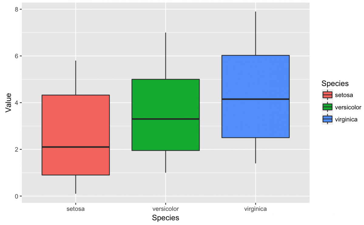
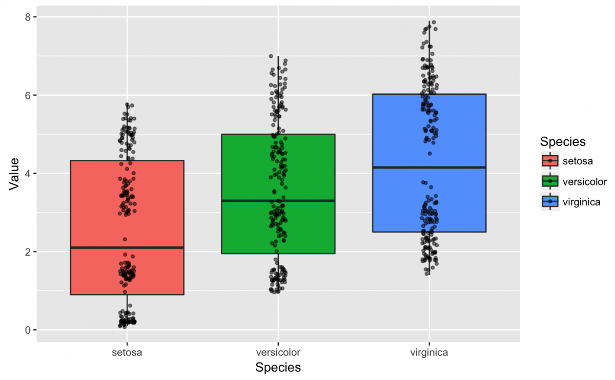
What do all these lines, shapes, and colors represent? A box plot is somewhat abstract without any data points, but we can easily add a geom_jitter() layer that drops the data points on top of the box plots. We also specify the alpha to 1/2 because slightly transparent points will help us see where the data clusters.
gg_iris_tidy +
           geom_boxplot() +
                      geom_jitter(width = 1/20, # very small width for the random noise
                                  height = 1/20, # very small height for the random noise
                                  alpha = 1/2, # transparent so we can see clustering
                                  size = 1) # very small points
Now that we have a distribution of points and the box plots, let’s calculate some summary statistics to help us understand what we’re seeing.
iris_tidy_df %>%
      group_by(Species) %>%
      summarise(
            min = min(Value),
            `25%` = quantile(Value, probs = 0.25),
            median = median(Value),
            mean = mean(Value),
            `75%` = quantile(Value, probs = 0.75),
            max = max(Value)
      )
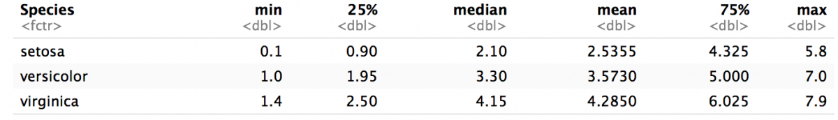
We are going to focus on the setosa box plot and summary statistics. The median for setosa is 2.10, and this lines up with the black line in the center of the red box. The median is a helpful measure because we know that half the observations are above this value, and the other half are below this value. Compare this to the mean for each Species of flower and consider how a variable with extreme values might differ in the two measurements (their mean vs. median).
We can also see the lowest cluster of points on the setosa box shouldn’t be below ~0.1 and the highest cluster shouldn’t be above ~5.8. Why do I say ~ (approximately)? The geom_jitter() adds a bit of random noise to the geom_point(), so its possible for the points to extend slightly past these boundaries. The geom_jitter() is helpful when data are over plotted on a graph, and you can also use position = “jitter” inside a geom_point().
We can add additional specifications to the box plots such as notch = TRUE.
gg_iris_tidy +
            geom_boxplot(notch = TRUE) +
                  geom_jitter(width = 1/20, # very small width for the random noise
                              height = 1/20, # very small height for the random noise
                              alpha = 1/2, # transparent so we can see clustering
                              size = 1) # very small points
Facets
For our final exercises, let’s switch back to a larger data set to show a few more advanced techniques in ggplot2. We’re going to use the nhanes data set we used earlier in this tutorial.
nhanes_df %>% glimpse(50)
Let’s start with a basic plot of body mass index (BMI) and how much time a person spent at a computer per day (CompHrsDay).
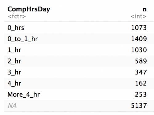
More specifically, the CompHrsDay is the “Number of hours per day on average participant used a computer or gaming device over the past 30 days. Reported for participants 2 years or older. One of 0_hrs, 0_to_1hr, 1_hr, 2_hr, 3_hr, 4_hr, More_4_hr. Not available 2009-2010.”
We will get a summary of the BMI variable using fav_stats():
nhanes_df %$% fav_stats(BMI)
And we will get a count of the CompHrsDay because it’s a factor variable.
nhanes_df %>% count(CompHrsDay)
We are curious about the relationship between body mass index (BMI) and screen time (CompHrsDay), so we are going to start with a simple violin plot that shows the distribution of CompHrsDay on the x and BMI on the y.
But we want to limit our plot to non-missing values, and remove any kids under the age of 19 (as in filter out AgeDecade != ” 10-19″ & Age > 18).
gg_nhanes_age_comp <- nhanes_df %>%
     filter(!is.na(CompHrsDay) &
            !is.na(AgeDecade) &
            AgeDecade != " 10-19" &
                Age > 18) %>%
     ggplot(aes(x = CompHrsDay, y = BMI))
# now build a violin plot
gg_nhanes_age_comp +
     geom_violin(na.rm = TRUE,
           alpha = 1/2,
           aes(fill = CompHrsDay))
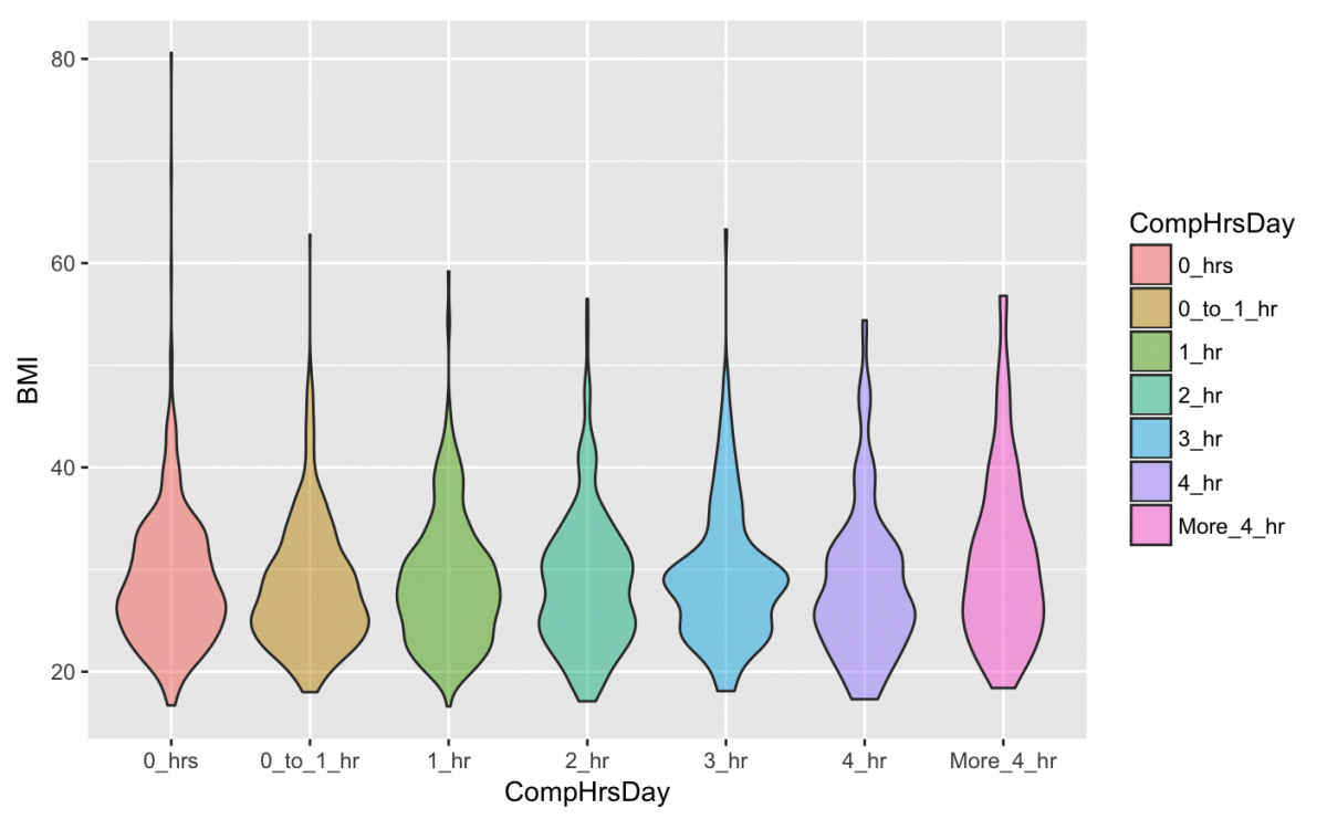
Violin plots are great if you have one numerical value and you want to see its density across levels of a factor or categorical variable. The geom_violin() is “a blend of geom_boxplot() and geom_density(): a violin plot is a mirrored density plot displayed in the same way as a boxplot.”.
I want to add the AgeDecade and Gender variables to this plot because I assume they are both influencing BMI. Adding two more layers to the same plot sounds chaotic, but luckily I have another option, facet‘ing.
A facet splits the data into subsets and plots these in multiple subplots. The syntax for the faceting is facet_grid(VARIABLE_Y ~ VARIABLE_X).
gg_nhanes_age_comp +
     geom_violin(na.rm = TRUE,
          alpha = 1/2,
          aes(fill = CompHrsDay)) +
     facet_grid(AgeDecade ~ Gender)
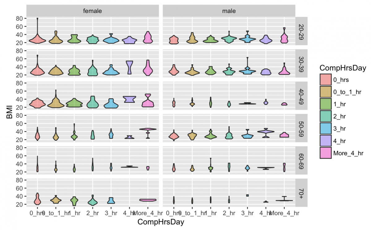
Now I have a violin plot for every combination of Gender by AgeDecade by CompHrsDay. There are a few additional adjustments I can make to this visualization to improve its layout, though. I should fix the x axis so the scale is readable. The AgeDecade is decreasing in the opposite direction of BMI, which makes it harder to interpret. Finally, BMI is on a fixed scale, but not all values have the same range. I want the y axis to be able to vary according to the data in that Gender x AgeDecade combination.
gg_nhanes_age_comp +
     geom_violin(na.rm = TRUE,
          alpha = 1/2,
          aes(fill = CompHrsDay)) +
     facet_grid(fct_rev(AgeDecade) ~ Gender, # change the order of the AgeDecade
                    scales = "free_y") + # allow y axis to vary
     theme(legend.position = "none") + # remove legend
     theme(axis.text.x = element_text(angle = 45, # make x axis at 45 degree angle so its easier to read
                                      hjust = 1)) +
           labs(x = "Computer hours per day", # add x axis label
                y = "Body Mass Index") # add y axis label

Here are all of the violin plots for all of the levels of Gender by AgeDecade by CompHrsDay. Faceting is great for adding variables to a visualization without adding them to the same plot.
We will do another example of faceting, this time with AgeMonths and Height by Genders. Let’s limit this graph to people under the age of 30 (360 months) and filter out the missing Height values.
gg_nhanes_ht_age_sex <- nhanes_df %>%
     filter(!is.na(Height) &
                   AgeMonths < 360) %>%
     ggplot(aes(x = Height,
                y = AgeMonths,
                color = Gender))
gg_nhanes_ht_age_sex +
     geom_point(size = 1/2)
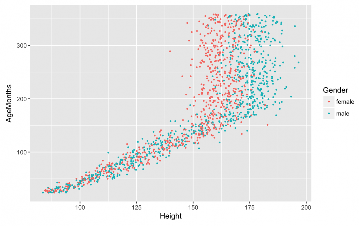
I’ve used color to distinguish male from female, but now I want to see the scatter plot broken up by AgeDecade. We are going to keep the color for Gender, but fit a line to the points with geom_smooth(). We will add AgeDecade with facet_grid(), but reverse the order of the factor variable (fct_rev()), remove the labels and breaks from the y axis using scale_y_continuous, and add labels to both x and y.
gg_nhanes_ht_age_sex +
          geom_point(size = 1/2) +
          geom_smooth(size = 1/2,
                    color = "darkred",
                    method = "loess") +
          facet_grid(fct_rev(AgeDecade) ~ .,
                    scales = "free_y") +
          scale_y_continuous(labels = NULL,
                             breaks = NULL) +
          labs(x = "Height (cm)",
               y = "Age (Decade)")
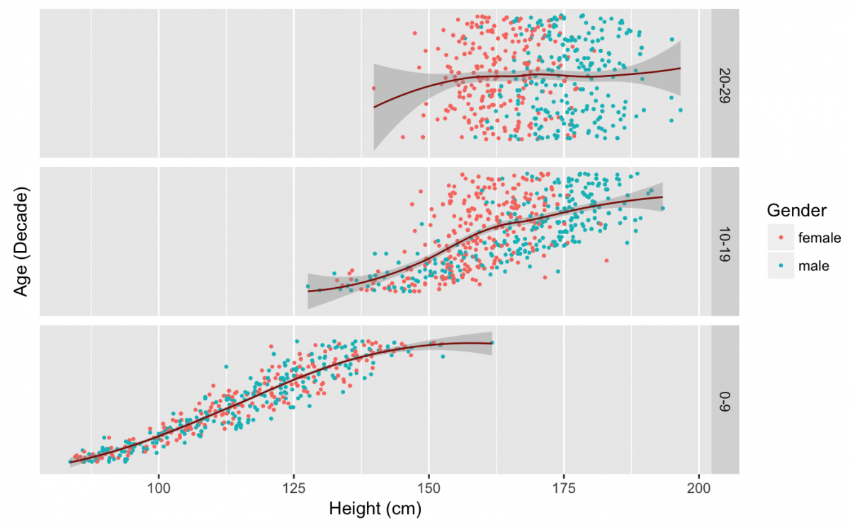
Now I can see long gradual growth in childhood (0-9), the separation of points between males and females in the teenage years (10-19), and the flat line representing fully grown adults.
The syntax for facet_grid() looks tricky at first, but you can get the hang of it with a little experimentation. Inside the parentheses, you can assign either facet_grid(. ~ VARIABLE) or facet_grid(VARIABLE ~ .), and this changes the columns vs. rows layout. You should also experiment with facet_wrap() for adding variables to your visualizations.
Exporting graphs
We’ve created quite a few graphs and visualizations in this tutorial. If we want to print or save any of them, there are multiple options (depending on the desired format or medium).
First we have to identify the graph we want to save. We can use ls() to see the objects in our working environment:
ls()
How about the line plot for the percent contribution to GDP by industry? When I export a figure I like to distinguish it from other graphs I am still tweaking by putting a _PRNT identifier on it.
gg_ind_gdp_PRNT <- gg_ind_gdp +
     geom_line(aes(color = Country),
                   na.rm = TRUE) +
     geom_point(aes(color = Country),
                size = 1,
                na.rm = TRUE) +
     labs(x = "Years", y = "Industry Percent Contribution to GDP") +
     scale_x_continuous(
               breaks =
                    c(1960, 1965, 1970, 1975, 1980, 1985, 1990,1995, 2000, 2005, 2010, 2015),
               labels =
                    c("1960", "1965","1970","1975","1980","1985","1990", "1995","2000","2005","2010","2015"))
gg_ind_gdp_PRNT
I will export this graph as a .PNG file. I learned a nice trick from Jeff Leek that checks for a directory and creates one if its not already there. Use the dir(“./”) function to check where you’re saving the image.
if (!file.exists("images")) {
     dir.create("images")
}
dir("./")
ggsave("./images/gg_ind_gdp_PRNT.png",
       width = 8,
       height = 5)
And here is our graph:

This was a very brief tutorial of the ggplot2 package, so I recommend learning more about the package by typing “library(help = “ggplot2″)” into your R console, checking out the ggplot2 tidyverse page, or purchasing the ggplot2 book.
- Getting started with stringr for textual analysis in R - February 8, 2024
- How to calculate a rolling average in R - June 22, 2020
- Update: How to geocode a CSV of addresses in R - June 13, 2020


Superb …covered a lot more than covered in most of videos out there.
Thanks, this covers quite a lot